A word about the Design
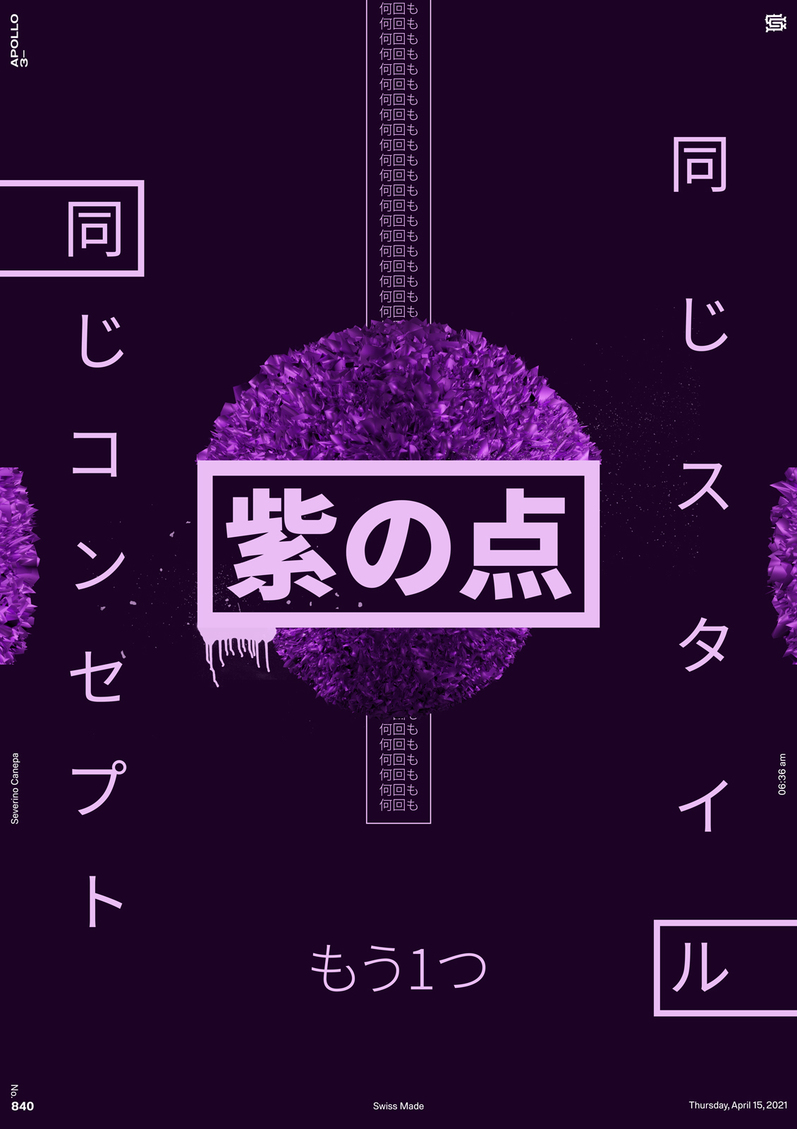
It is a good day to design a purple poster! To change the look a bit, I used small touches of dirty and spray paint brushes here and here on the canvas.
I still don’t feel bothered by the Japanese typeface, which is why I continue to use it. I also noticed a mistake I made on the previous posters. I copy-paste the title of one design to another and finally noticed that I used the name of the color in Japanese. For example, I designed yellow and said “Yellow Dot” on a poster where I used orange. Well done!

