A word about the Design
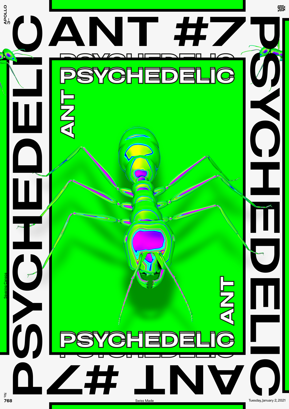
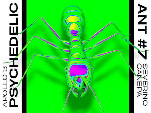
Today, I chose to explore a new style with the 3D ant and use more and larger typography. I like the minimalist look of this poster. Everything is large, bold, and strong. I was hesitating to choose another color for the central rectangle, but it finally looks good—as if the ant is leaving that shape.

