A word about the Design
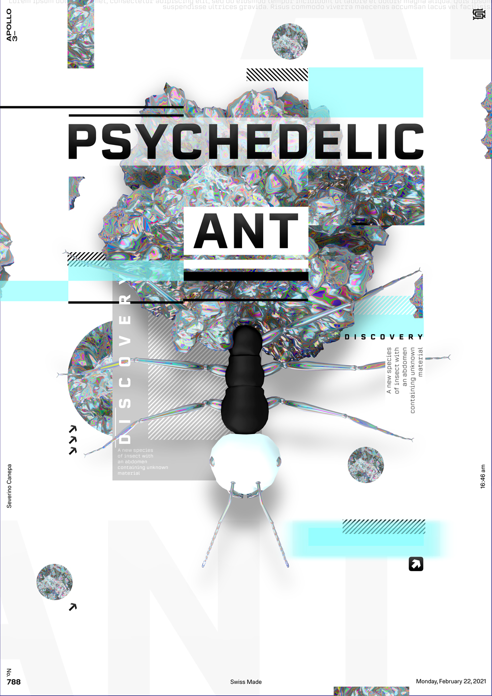
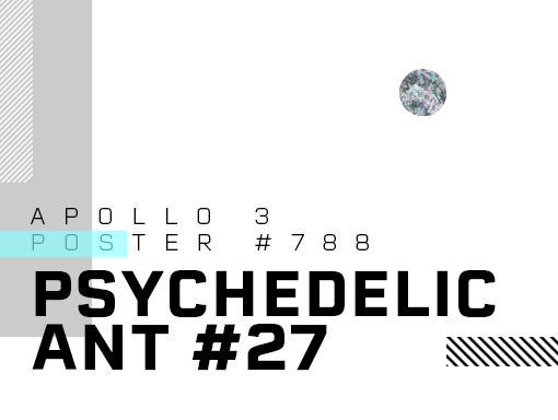
Today’s poster continues yesterday’s design. I went for a more complex look compared to yesterday’s minimalist design. The number of small elements in the design reflects its complexity. At the same time, the layout follows a minimalist approach based on the grid’s three lines.
My design process took an unexpected turn when I accidentally used the text tool. I was unaware that the background rectangle was selected, so I typed inside it. The result was a unique appearance of the Lorem Ipsum text on the top left of the canvas, inspiring me to explore more such accidental discoveries.

