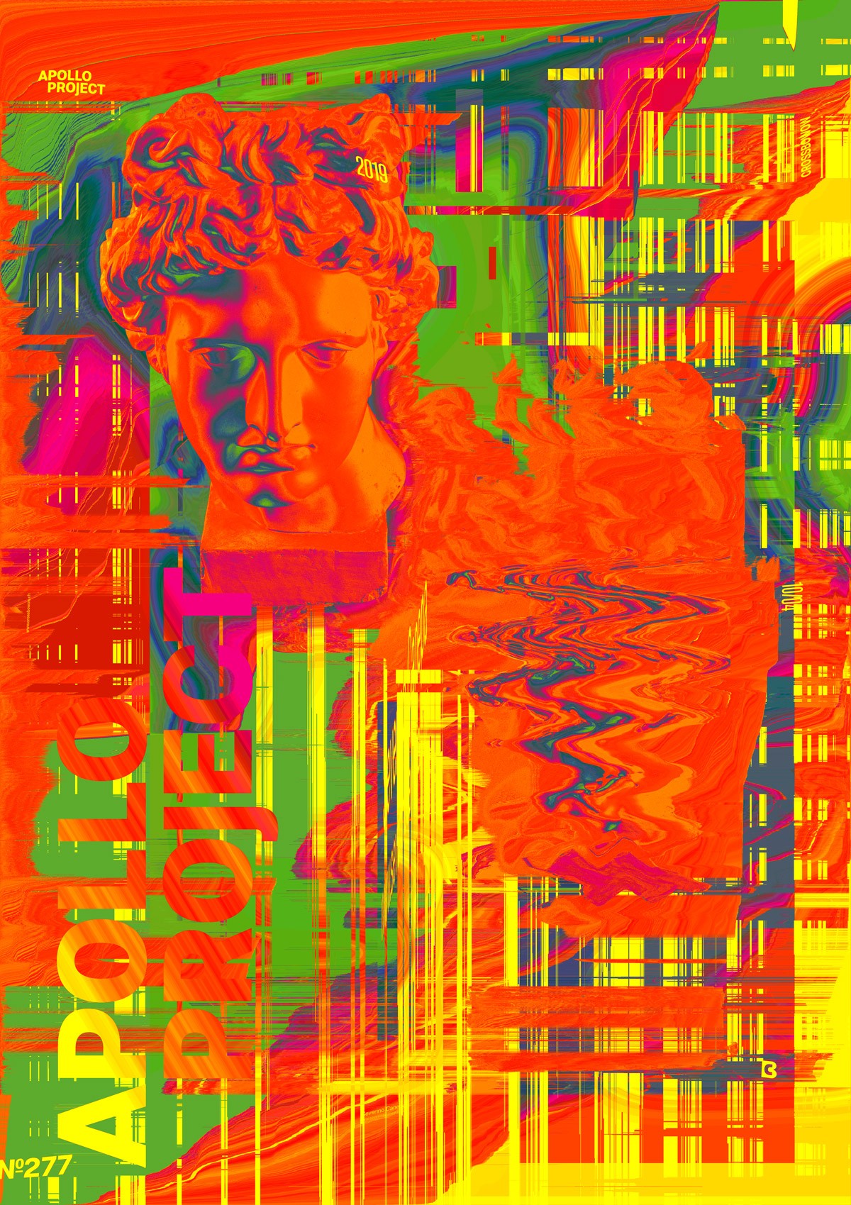
Still realized with Processing 3 and the script written by Kim Asendorf, here is poster design number 277. It is a grunge, messy poster that looks like a rough draft, an experimentation of what I can bring from Processing.
The Design

I have to admit that I am not satisfied with today’s poster. I spent too much time trying to generate a good image with Processing, and I forgot that the colors don’t match, creating a strange feeling when you look at its design.
I am asking myself how I could let it with this inexistent composition, no layout, and no taste in colors. I want to put the fault somewhere else, but I don’t know where. I want to think that we can’t stay on top all the time, but it is probably another lie.
When I decided the design was finished, I was lazy. There is no excuse!
Speed Art Poster #277
It is a nice day to design an ugly poster with no style. Well done!
If you want to know how to create a lousy poster demonstrating all the graphic design principles, watch the speed art video and learn everything you should not do.
To conclude, have a nice day, and see you tomorrow for a better poster design!

