Hey! Today is the time to say goodbye to the poster mini-series Pixel Poster! I am not sad because I began feeling tired of them! So, I finish it with some pleasure.
One more time, the mini-series would not have been possible without using Processing 3 software and the lines of code written by Kim Asendorf.
The Design

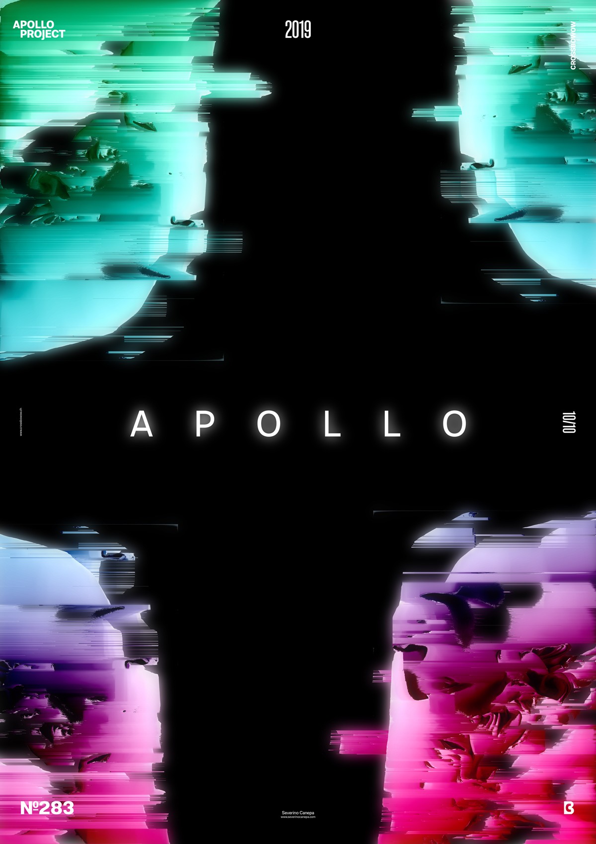
To celebrate the last poster of the mini-series, I decided to create a minimalist design with spatial and galactic qualities. The glitch effect, or pixel sort effect, applied to the pictures by Kim Asendorf’s script plays a role in the “out of space” effect.
According to your interpretation, I placed the four pictures on the side of the canvas because it was the better way to create a sense of an opening or closing-up movement. I applied the title and the four shapes, a Gaussian Blur Filter. I duplicated the layer two times and placed one layer behind and one over. I set them with different blend modes to give these shiny reflections.
To finish as a final touch, I duplicated some parts of the shapes and placed them behind to break their unity. Then, I looked at the design and thought it was time to stop before adding too manyelements. I felt the vibe; I was absorbed by what I was doing, and it was too late when I stopped. The feeling left. Fortunately, the poster is good enough!
Speed Art Poster #283
I am in a hurry to design something new without processing! It was nice, but only for a moment. As usual, you can look at the speed art video tutorial I made. I recorded myself from the start to the end of the process. Take a look and see if the poster interests you.
Have a nice day, and remember to see Poster #284 tomorrow!


