A word about the Design
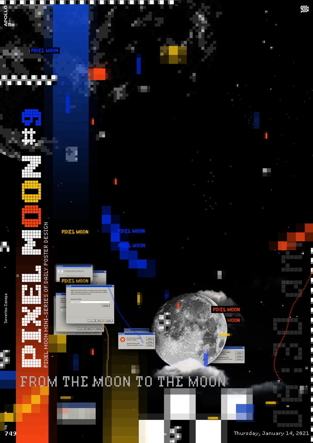
This composition has a good balance between the top and the bottom. I am satisfied with it. The viewer’s eyes slide from the bottom to the top and go down again to the right.
Like all the posters in this mini-series, I created them using a Pixel Photoshop Action that is ready to buy.
As well as Old User Interface window images.

