A word about the Design
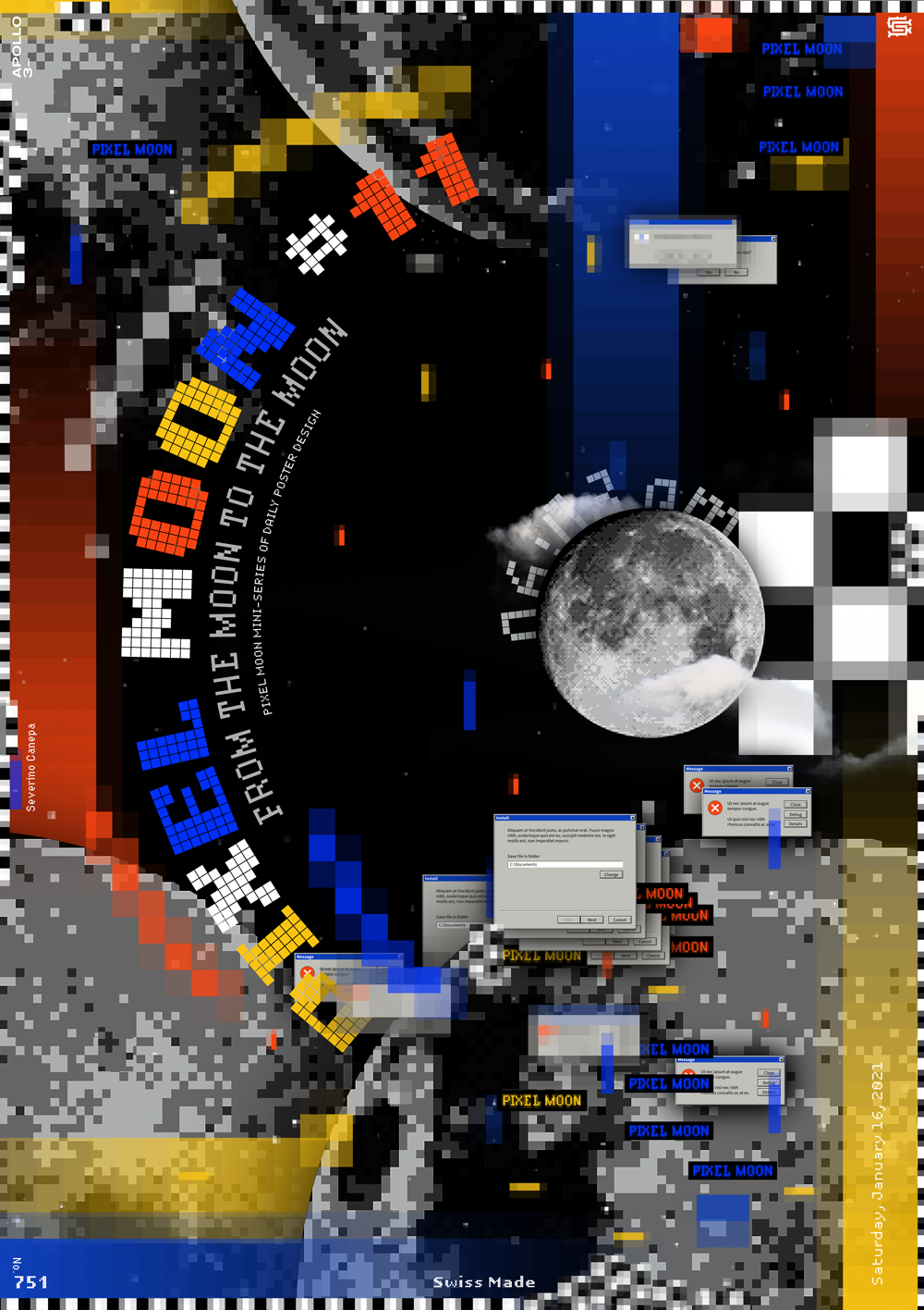
The number eleven has a little typographic improvement. I set the pixel typeface on half a circle around the small moon. This detail adds a nice extension of the moon’s circular shape. It is like a repetition of it, and it also brings a nice contrast with the squared pixels.
As you know, I used this Pixel Photoshop Action, ready to buy to deal with the moon.
I use the Old User Interface window images, too.

