NY4 Poster #1028
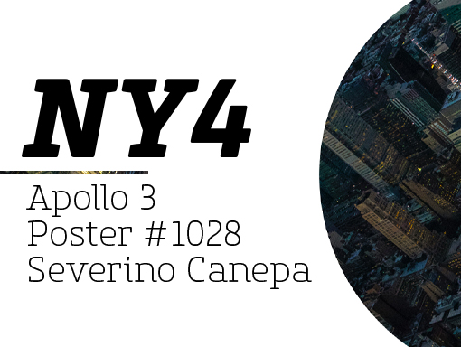
About the poster I take a picture of New York and compose a poster with it, typography, and a grid. Speed Art Video Tutorial
NY3 Poster #1027
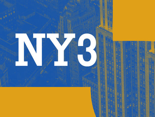
About the poster I like the large types and the games they play with the picture shapes. One more time, the color scheme is simple and effective. I used a gradient map to do it. Speed Art Video Tutorial
NY2 Poster #1026
About the poster Yes, it is a new mini-series again!The principle is simple. I started by cutting a picture of New York’s buildings into shapes and composing the canvas with them. Speed Art Video Tutorial
NY Poster #1025
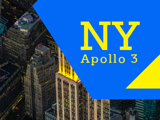
About the poster I needed two large letters, a photograph, and some colors to elaborate on today’s design. Speed Art Video Tutorial
Superimposition #20 Poster #1024
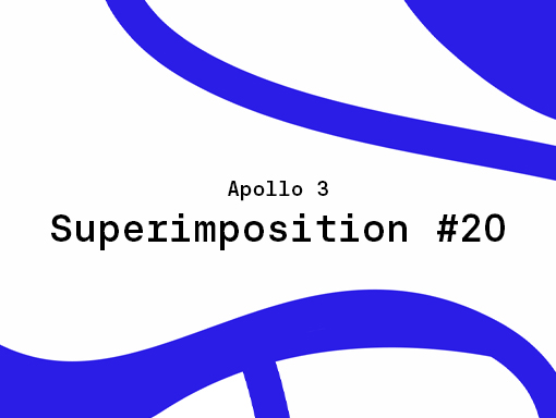
About the poster The last poster of the mini-series is an abstraction like the design I made yesterday. Speed Art Video Tutorial
Superimposition #19 Poster #1023
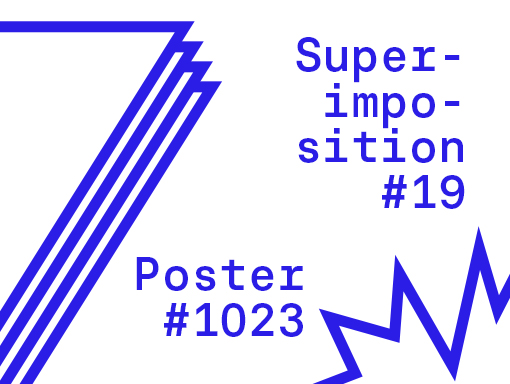
About the poster Yesterday, I said I would create strange and weird shapes and compose a design with the same style as the mini-series. Here it is. Speed Art Video Tutorial
Superimposition #18 Poster #1022
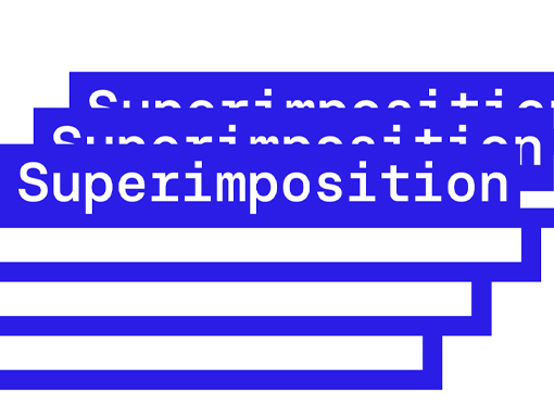
About the poster I keep exploring abstract composition with basic and geometric shapes. Tomorrow, I will use random and unusual shapes. Speed Art Video Tutorial
Superimposition #17 Poster #102
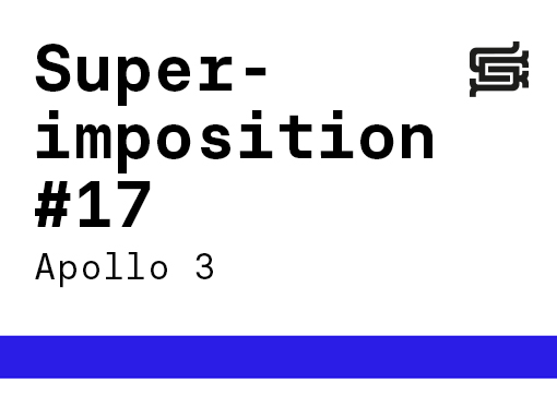
About the poster Today, I felt abstract! Speed Art Video Tutorial
Superimposition #16 Poster #1020
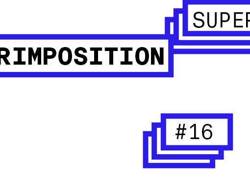
About the poster Today, I removed the element from the canvas, which creates an excellent impression of depth and a sense of immersion. Speed Art Video Tutorial
Superimposition #15 Poster #1019
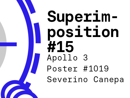
About the poster For a long time, I didn’t use a pattern as a background. As you will see in the video, I placed each dot one by one, a relatively long job. Speed Art Video Tutorial