Psychedelic Ant #11 Poster #772
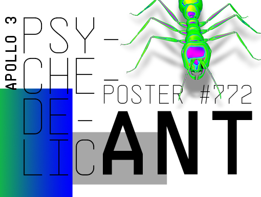
A word about the Design I used a new typeface I recently bought in a cheap bundle, which gives you just enough font from a family to want and need more! The typeface works well because it is a quality font crafted with care.To celebrate my last font acquisition, I made a typography-based creation where […]
Psychedelic Ant #10 Poster #771
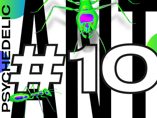
A word about the Design I am going deeper into the psychedelic area of design. I am exploring and letting myself soak into that topic. I follow the mood and try to improve the mini-series each day. Speed Art Video Tutorial
Psychedelic Ant #9 Poster #770
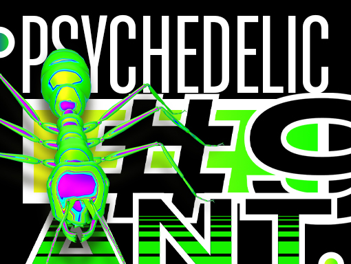
A word about the Design To give it a try, I started today’s poster with a black background that brings another dimension to the design. It feels different, and it visually tastes different.Whatever, I prefer the white background. There is possibly something else I can try to improve its appearance. This is for tomorrow. Good […]
Psychedelic Ant #8 Poster #769
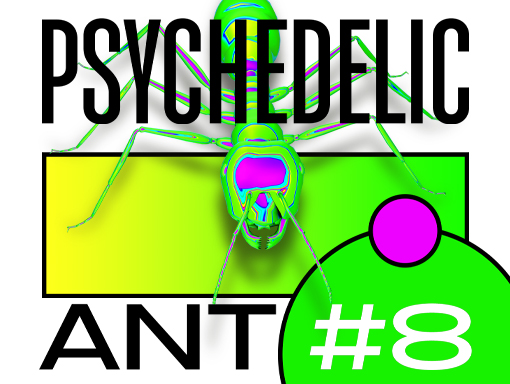
A word about the Design It is a further exploration of the style I have been creating these last few days. I like the large, bold, and strong elements surrounding the 3D Ant. I played more with typography and geometric shapes to create that look.Get ready to see more designs like this one in the […]
Psychedelic Ant #7 Poster #768
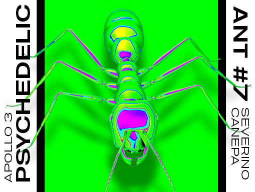
A word about the Design Today, I chose to explore a new style with the 3D ant and use more and larger typography. I like the minimalist look of this poster. Everything is large, bold, and strong. I was hesitating to choose another color for the central rectangle, but it finally looks good—as if the […]
Psychedelic Ant #6 Poster #767
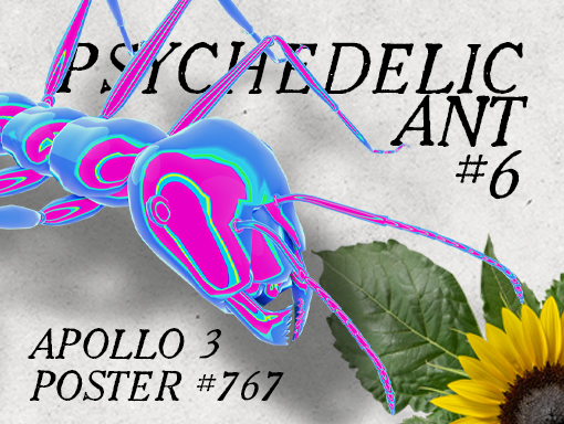
A word about the Design The combination of a vintage-style background and 3D elements doesn’t work very well. I probably didn’t use it the right way, and the same is true if I tried to find a visual solution that works.The idea was to select different graphics without relation between them and try to compose […]
Psychedelic Ant #5 Poster #766
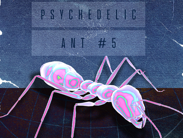
A word about the Design I made something nobody should do in the Graphic Design area. I extended a raster image by more than 120%, making some pixels rectangular because I didn’t use the image’s proportions. But don’t worry, I made it on purpose. Speed Art Video Tutorial
Sketches of January 2021
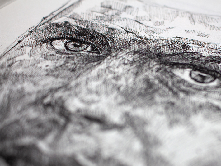
Sketches of January 2021 I took the time to draw some sketches this month, and here are the results. Without a preliminary pencil sketch, I started drawing with the fine liner. Of course, I can’t erase the mistakes I made and notice while I advance during the process. That’s why some of my portraits have […]
Psychedelic Ant #4 Poster #765
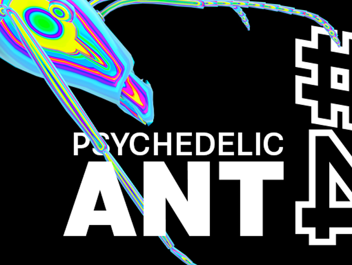
A word about the Design The mini-series of posters made with the ant continues with a new version of the iridescent texture material and font pairing. I am exploring different ways with the iridescent material in Blender, and it is so much fun to try different settings and see the results that I want to […]
Psychedelic Ant #3 Poster #764
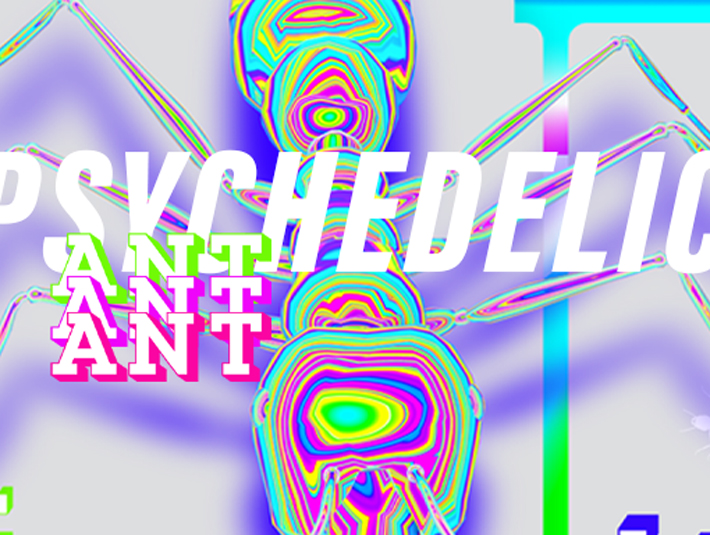
A word about the Design I admit that I am amazed by this 3D ant. I like the 3D artwork made on this mesh and am trying to sublimate it on each poster.I am also considering the mini-series I have been overusing these last months. It is the easiest way to save my daily time […]