Here I Am #2 Poster #802
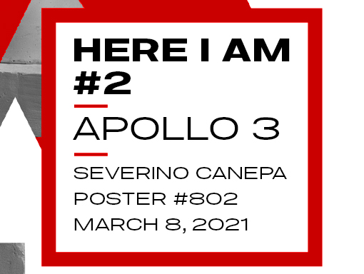
A word about the Design To create Here I Am Number 2, I inspired myself with the first one I made in 2019. I took the same concept based on a minimalist color scheme, a large geometric shape as a background, and a picture of Apollo’s statue. It was my starting point for designing a new […]
Sophocles Pixels Poster #801
A word about the Design Today, I worked on Sophocles’ statue. Inspired by the vaporwave style, I desaturated it, added a gradient layer from purple to blue, and mixed it with a glitch effect.The result looks like a minimalist design, but creating the glitch effect by hand was difficult and time-consuming. Speed Art Video Tutorial
Height Hundred Poster #800
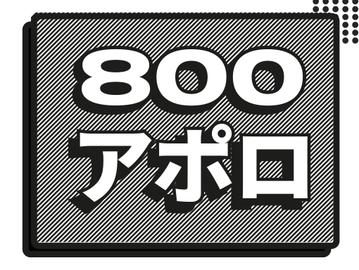
A word about the Design Today, I am celebrating my eighth hundredth birthday with a vector design for a poster. Yes, I misspelled 800 two times on the poster. That’s life. I have to say that I took the time to create many different elements, and suddenly, Illustrator crashed. There is no other choice but […]
Sophocles Poster #799
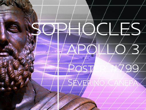
A word about the Design I created a 3D render of Sophocles in bronze using Blender. Then, I imported it into Photoshop to refine the result. I also experimented with unbalancing the layout using the statue.Inspired by the vaporwave style, I used purple colors, which contrast nicely with the bronze colors. Speed Art Video Tutorial
Roses #6 Poster #798
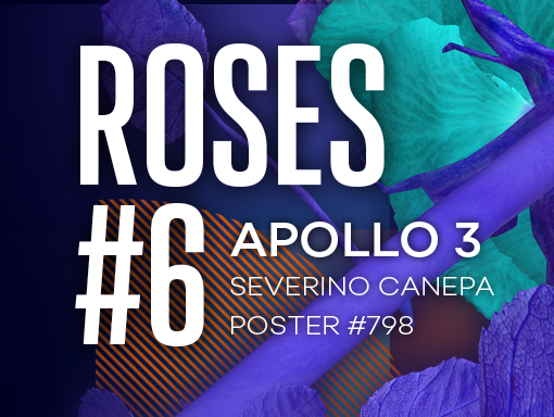
A word about the Design I tried to create a design inspired by the one I did yesterday, and I must admit that I made a better creation that day before.It was the beginning. I was fresh and motivated without any expectations about the result. Instead, today, I had expectations, and they were maybe too […]
Roses #5 Poster #797
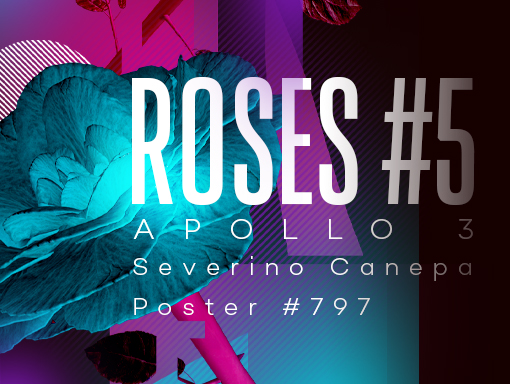
A word about the Design I attempted to create a design inspired by the one I made yesterday, and I must admit that I made a better creation the day before. It was the beginning. I was fresh and motivated, without any expectations about the result. Instead, today, I had expectations, and they were maybe […]
Roses #4 Poster #796
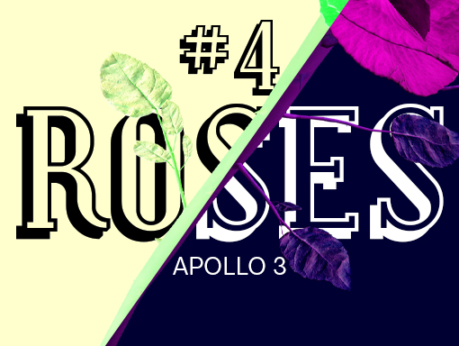
A word about the Design I like the color contrast on today’s poster: the pastel yellow and the deep blue marine work perfectly together. The serif font is also a good choice. I’m unsure about the slanted separation of the two colored areas. It might look better if it were slanted vertically or horizontally. Speed […]
Roses #3 Poster #795
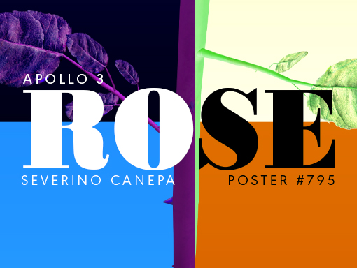
A word about the Design This is the third poster in the mini-series, and I was surprised by the colors in this creation. I also rotated the flower to highlight its contrasting color on the right. Unintentionally, I depicted the transition between the winter and spring seasons. It should be interpreted as such! Speed Art […]
Roses #2 Poster #794
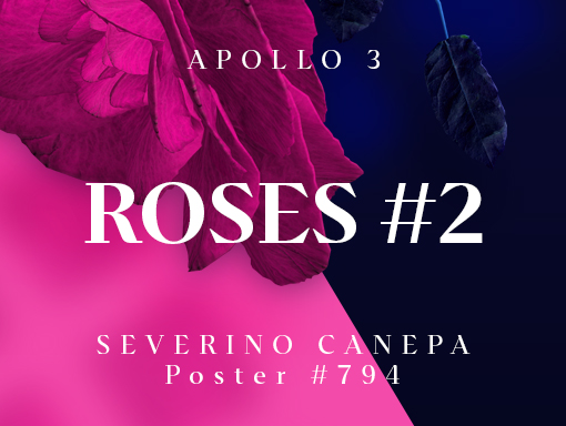
A word about the Design I prefer to avoid miniseries, but they’re helping me out right now, so I can’t escape them. They save me time and allow me to work on things I enjoy in my free time. I’m working on something specific that I’m excited to share with you when the time comes. […]
Roses Poster #793
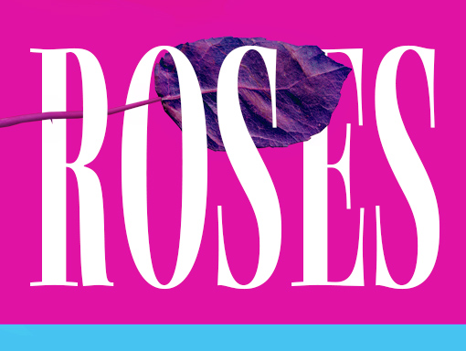
A word about the Design I created today’s poster using a 3D-rendered image of a rose. I’m proud of this one. I usually try to avoid minimalism because I tend to overthink each detail and end up spending more time creating something that looks like it only took me three seconds to make. But today, […]