About the Design
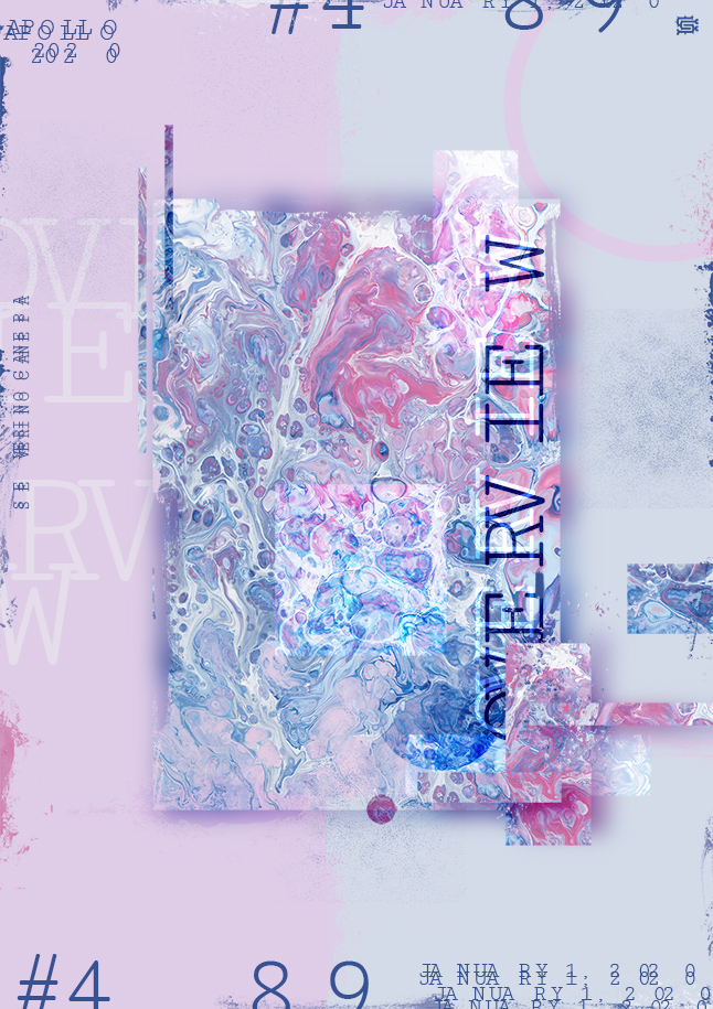
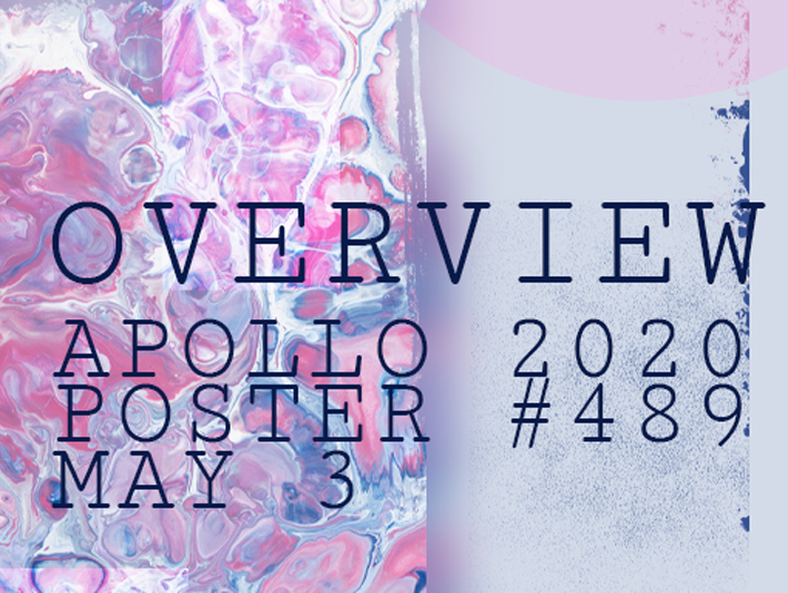
Yes, I think it is an unofficial mini-series of posters with the same approximative style: a monospace font, a fresh abstract painting or inked image shot by a photographer, a layout, some grunge effects, and here we are.
I don’t usually like to use brushes because I think I should create my own—something that I plan to do—maybe in the next life. If everybody uses the same brushes, where is the originality?
Speed Art Video
I almost didn’t make a video today because I inadvertently erased yes the video file. It perturbated me so much that I forgot to change the poster’s date!
I finally decided to work on the poster a bit more to create a short video tutorial with only fourteen minutes of video. The twenty-first minute is lost in the trash.
Tomorrow, I will design poster number 490. Come back to discover it, take good care, and see you soon!
Music Credit
Today, I used the song “New Land” to create the video tutorial, and ALBIS made it. They don’t have a YouTube channel or even a Website.
Image Credit
The picture I selected to create Interaction has been shot by the photographer Pawel Czerwinski!

