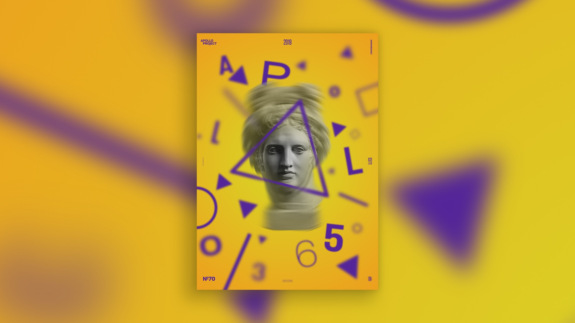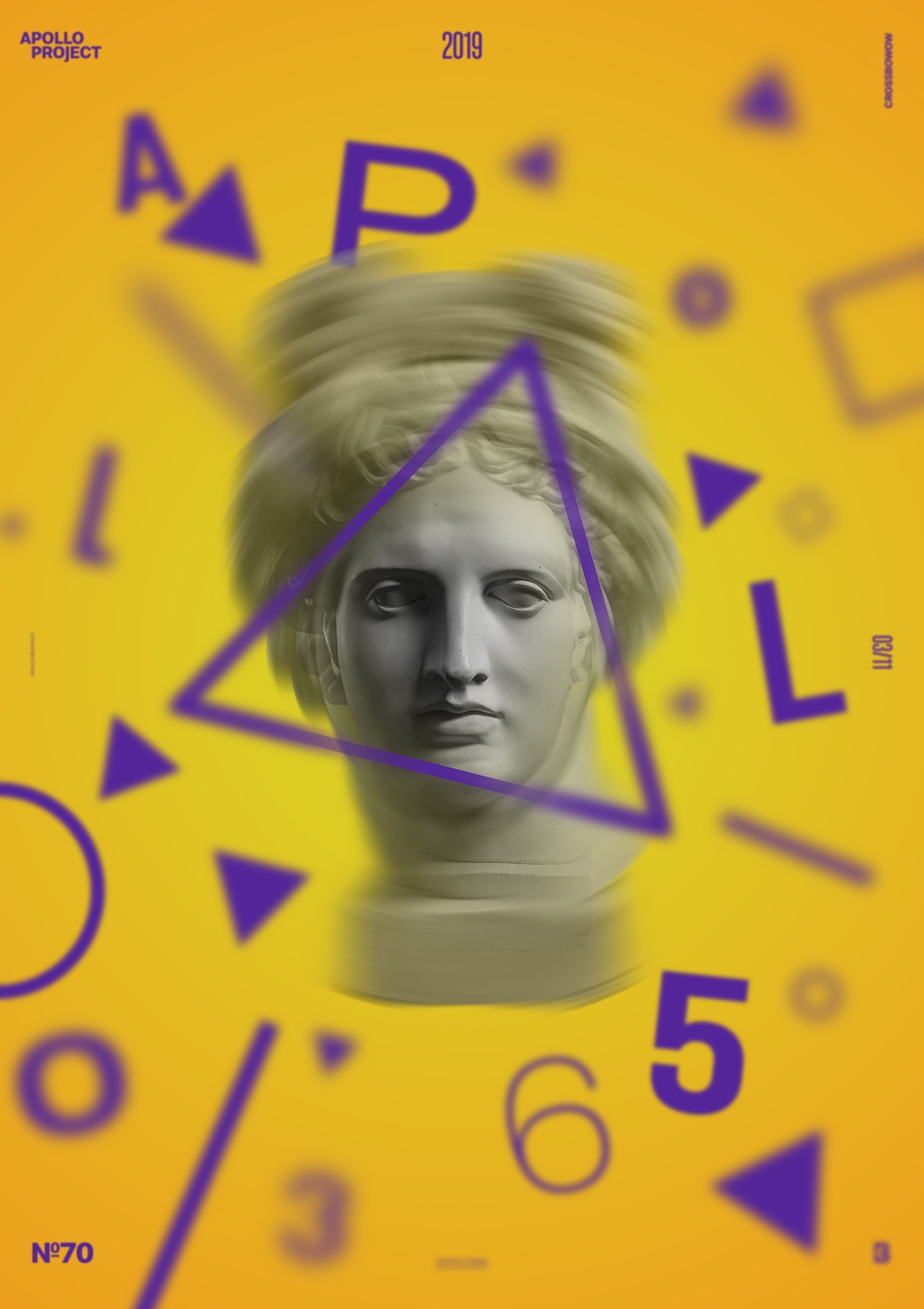
To create Poster #70 Orbit, I only used Photoshop’s blur options to suggest an effect of speed and gravitation around Apollo’s head.
I used one of the quantity contrasts reversely: 20% of Purple and 80% of Yellow-Orange—it is an approximative estimation.

I tried to make eyes focus on Apollo’s eyes by generating a radial blur. Later, I added a triangle, which shows a mix of some parts made with blur and others that do not accentuate the viewer’s focus. The eyes are the center of a “planet” and represent the attraction that makes the elements around Apollo’s head seem floating like a satellite around an orbit.
Orbit Speed Art Poster #70
Another poster design for another day. I am starting to feel the challenge of making a poster daily for a year. It’s very challenging, and I already used every theme. I think that I am in a slump after finishing this poster. I hope it will leave before tomorrow!
I hope you will enjoy watching me work on poster #70. Have a nice day, and meet me for poster #71 tomorrow!

