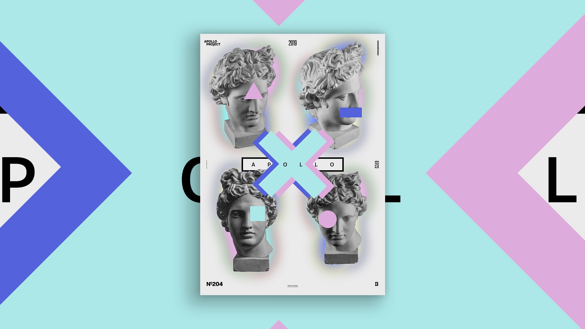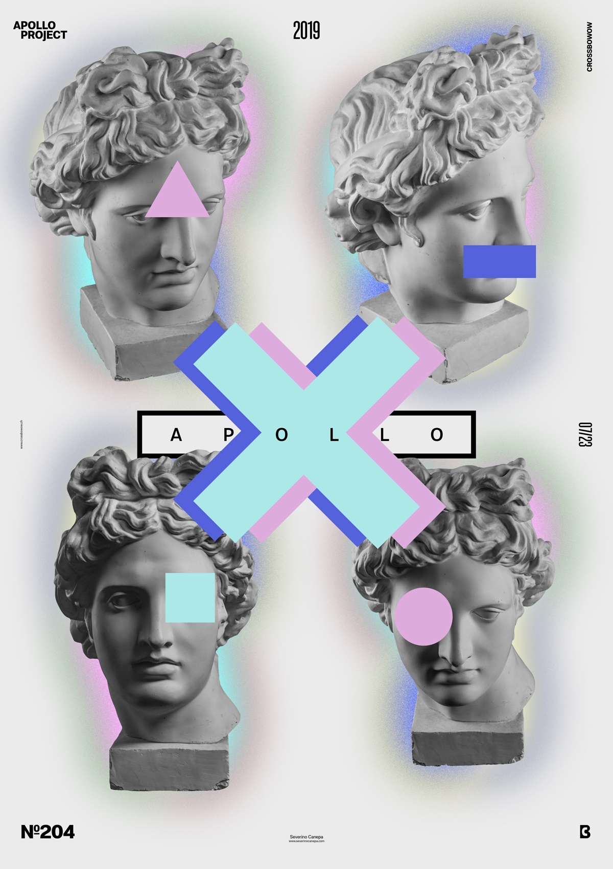
The mini-series of Poster Universalis is behind me, and I am starting something new every day again. Today, I created a minimalist poster design with four pictures of the Statue of Apollo.
The Design

With the mini-series Universalis, I didn’t show Apollo very much. So, I decided to fix that today by using four of its pictures in the design. After placing them, I drew colors behind the statues, but the colors I used weren’t good. I duplicated them the first time and applied a blur filter, and then I duplicated the layer a second time and hit the Filter Add Noise. I set this layer’s blend mode under Difference to change the colors.
When I was happy with the colors, I picked some of them and created geometric forms that I placed above the Statues of Apollo. I also put three large crosses in the center of the canvas with aqua, blue, and pink tones. That’s all I can say about this poster!
Speed Art Poster #204
Again, thank you very much for following my work! I appreciate it so much!
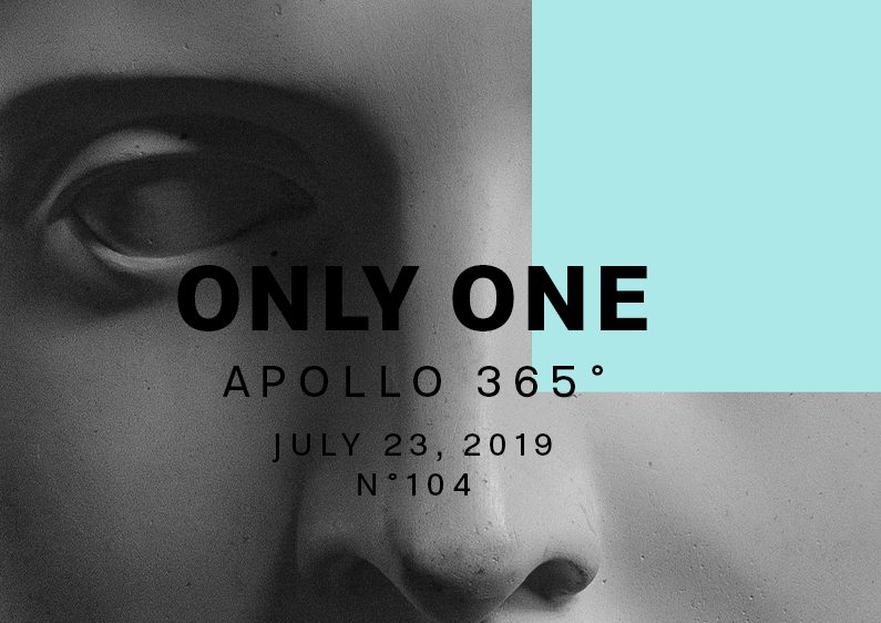
As usual, you can watch the Speed Art Video I made about the process I used to create Poster Only One.
See you tomorrow for the next poster design, number 205!

