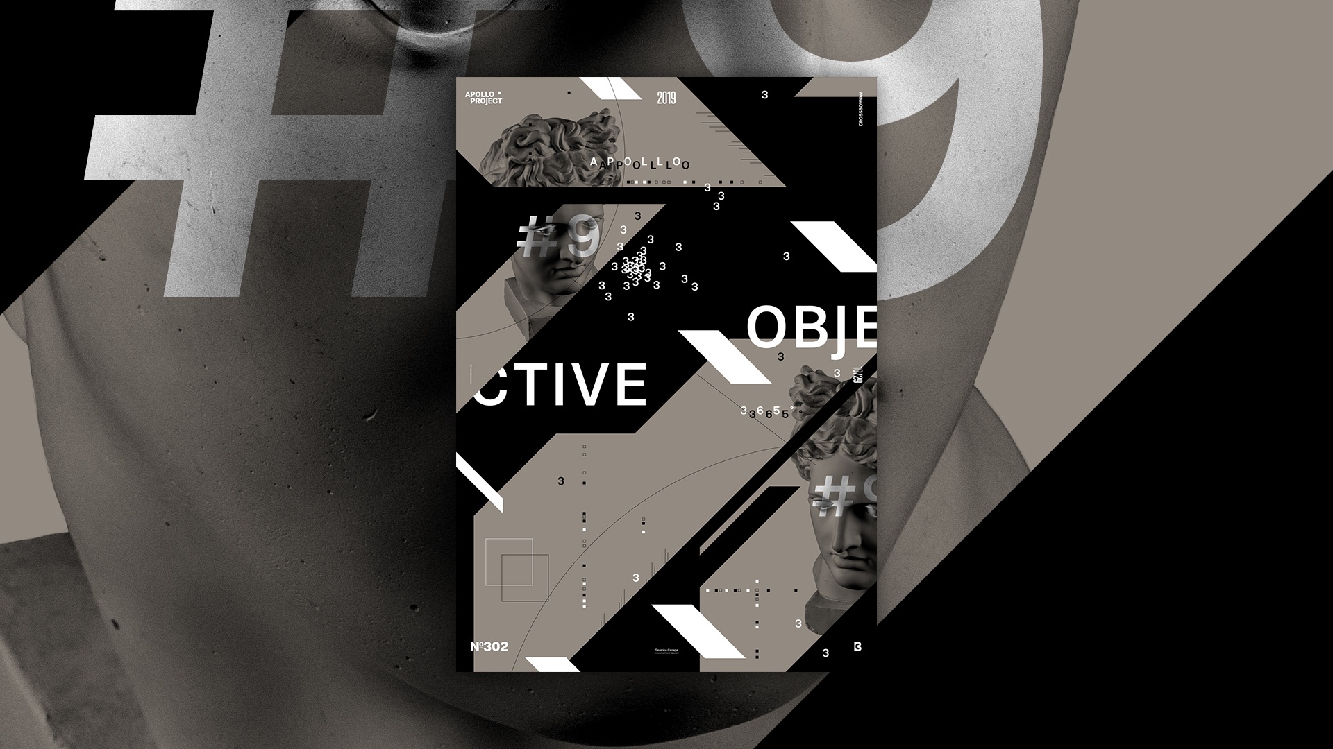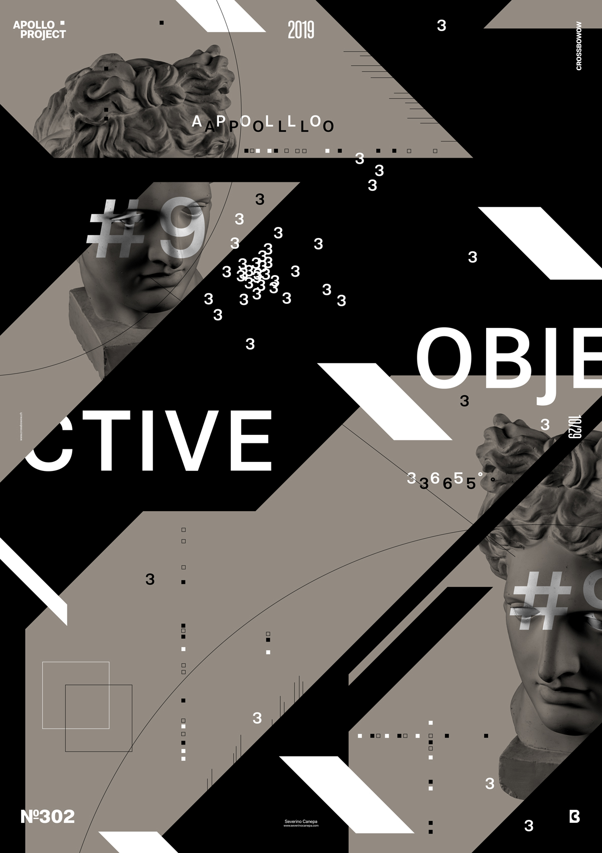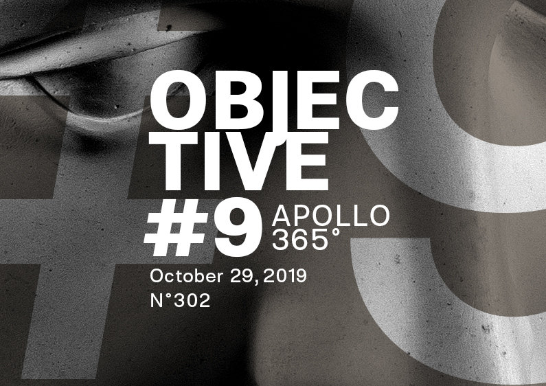
I decided to continue exploring the poster mini-series Objective until I realized 20 posters in this style is not an easy solution because I am already tired of them. By affirming that, I put my perseverance to the test and see where I can bring this mini-series.
The Design

As you will notice by watching today’s video about the creation of this poster, I had some difficulties setting the forms in the background. It works on the top left but not on the bottom right. This is probably in contrast with the large shape on the left and the style of the other with smaller forms.
I am disappointed with the background, but the white trapeze shapes create a nice effect of repetition and help direct the viewer’s eyes from top to bottom.
The color is also nice; it is a grey-orange that looks dirty, like an isolated color from a picture, which means it looks more natural.
Speed Art Poster #302
If today’s poster is unsuccessful, look at the speed art video tutorial number 302.
Come here tomorrow to discover the Objective 10 poster design! Have a nice day!

