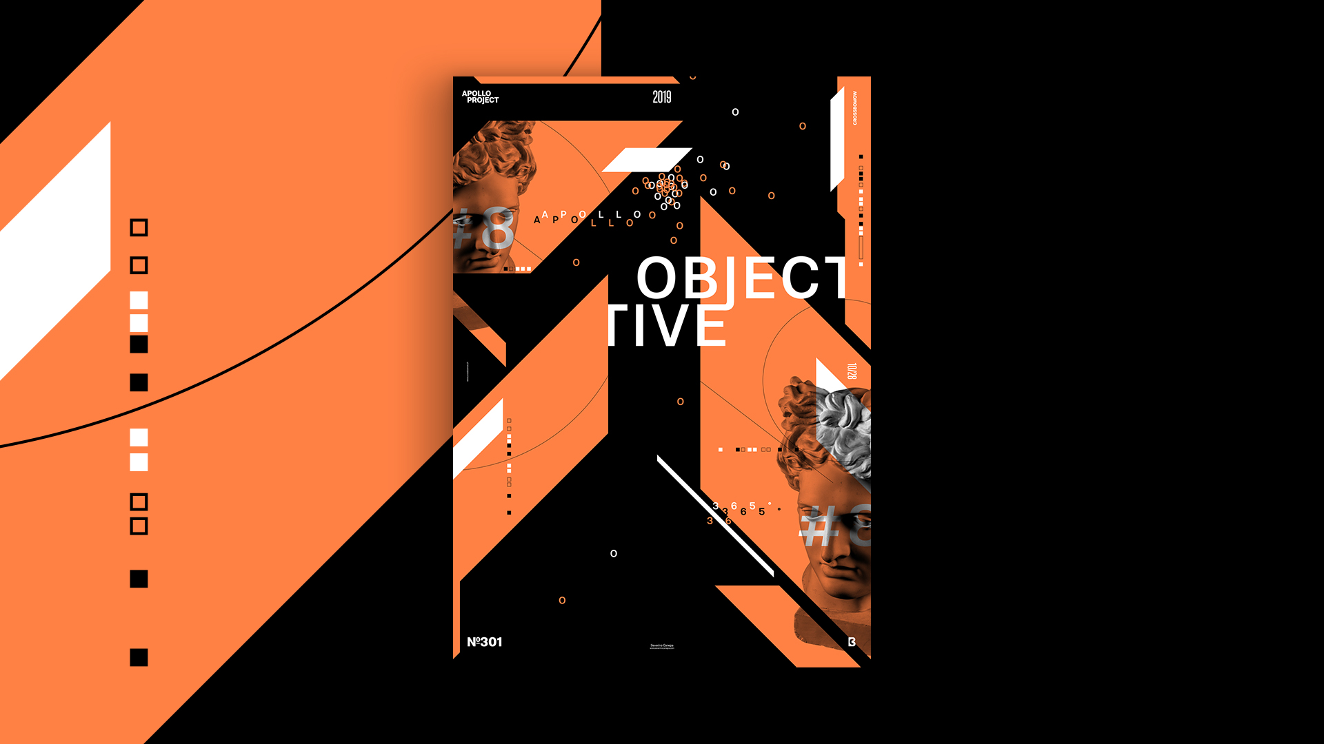
This Monday, I woke up 30 minutes late; I did exercise in a dirty basement with several cats’ shit near the wall — this is how I noticed there were hidden cats there, and these shits made me feel sick. After that, I find the courage to buy something to eat. And then, I started to design the Objective 8 Poster.
The Design

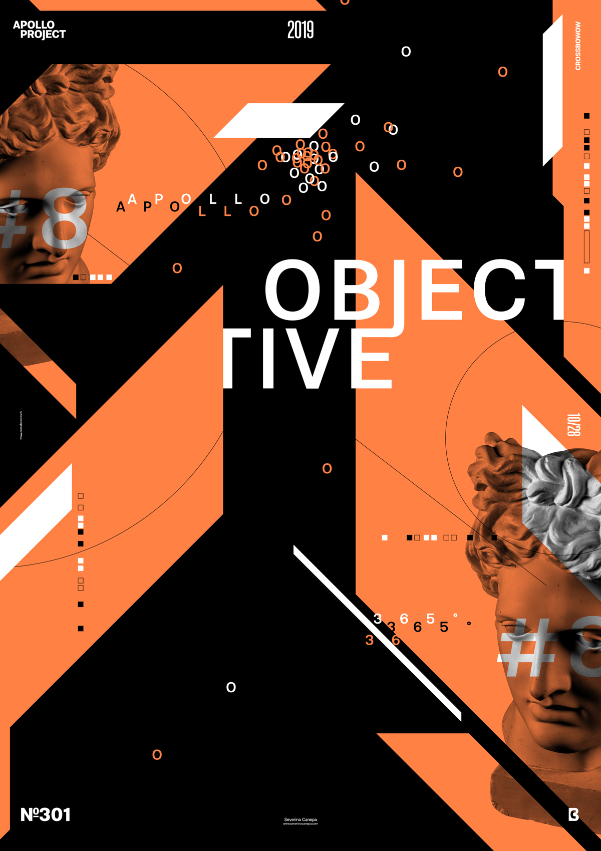
I continue exploring the mini-series layout and style with the help of oblique shapes. They add dynamism and a sense of speed to the composition. I use an excellent orange color that I love more and more as I see it.
I was about to forget that I am creating poster number 8 instead of 7, which is why you will see me type seven in the video. Fortunately, I noticed it! When you focus too much, you forget that kind of detail. I must stay aware. I also like the title, which goes behind an orange form, and the fact that the letters J and E join each other.
To make the poster enjoyable, I added more small squares here and here, like a path to the eyes.
I am happy and satisfied with the Objective 8 Poster and am considering continuing to create twenty posters in this mini-series. I want to see if I can enhance it — it is certainly possible! — and find more ideas without spending more time on it.
Speed Art Poster #301
I am almost sure that you like the Objective 8 Poster! How can’t you want a well-made design?
If you want to watch me work on the poster, watch the speed art video tutorial 301.
I’ll see you tomorrow for the Objective 9 poster. Have a nice day! Don’t forget to let a comment on my social media!

