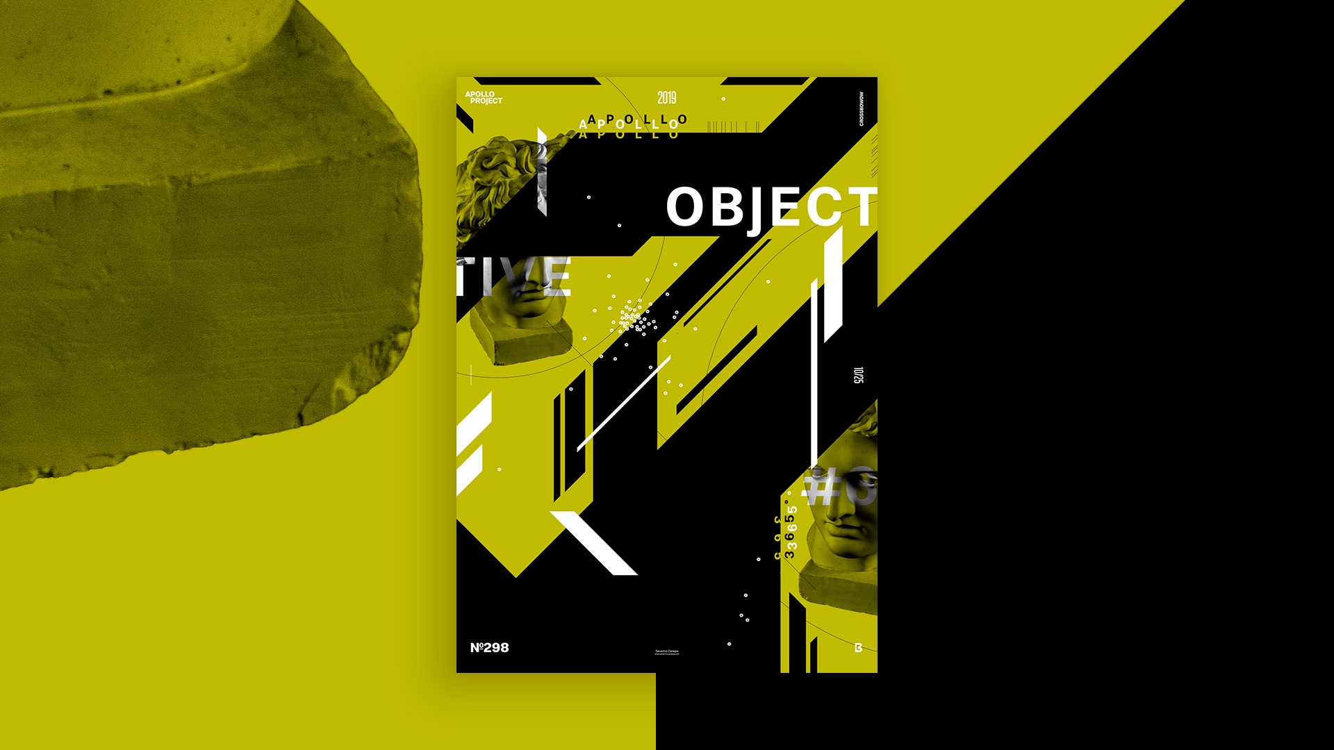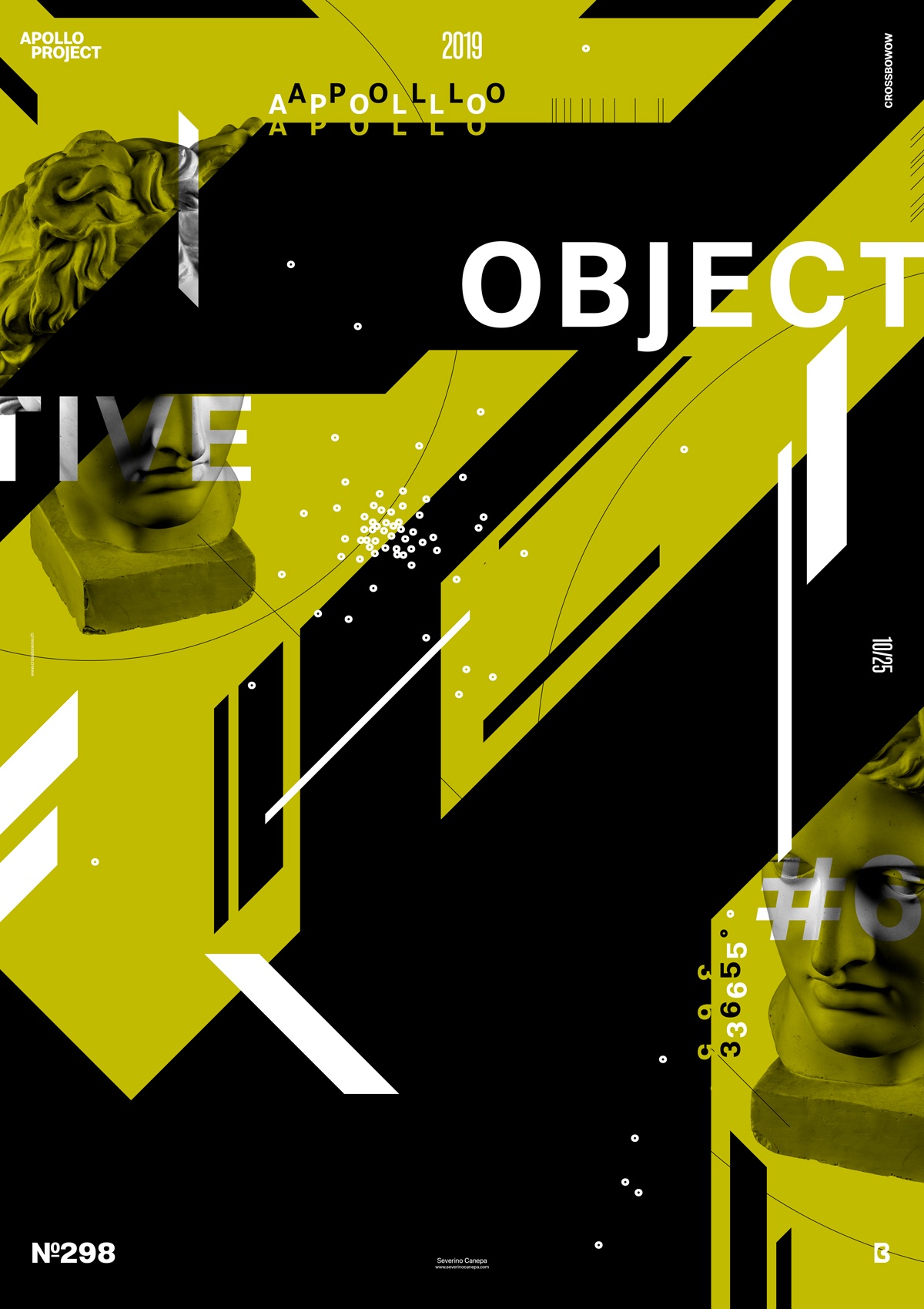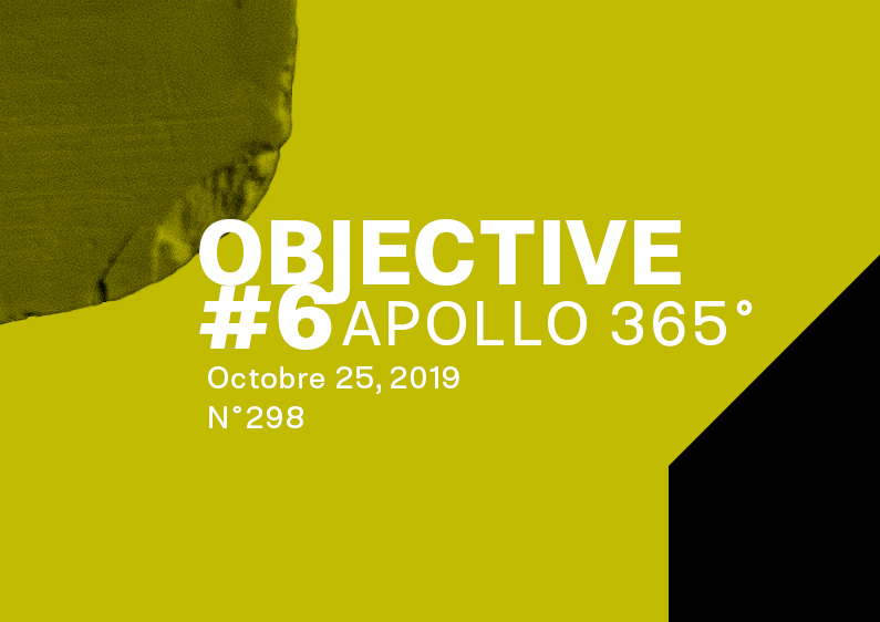
One more sunny day spent playing basketball with a painful elbow, caring for my daughter, eating, working, showering, and not forgetting to design the Objective 6 poster.
The Design

Why should I make a colorful rectangle on the background to start the design?
It wasn’t a rule of the mini-series, and I break it today by generating some obliques. A little idea that creates a new visual makes it interesting with a few changes! The little idea that will change the face of the Objective mini-series.
After questioning why I used rectangles, I changed the poster to a new version with obliques and futuristic shapes. The result is a dynamic poster that is loyal to the first posters and taking the next step.
Only for that reason is today’s poster successful.
Speed Art Poster #298
I hope you are curious about how I made speed art video tutorial number 298 because I had so much fun designing it. So, take a look and comment about the final visual. I’ll see you tomorrow for the poster creation Objective 7! Have a nice day!

