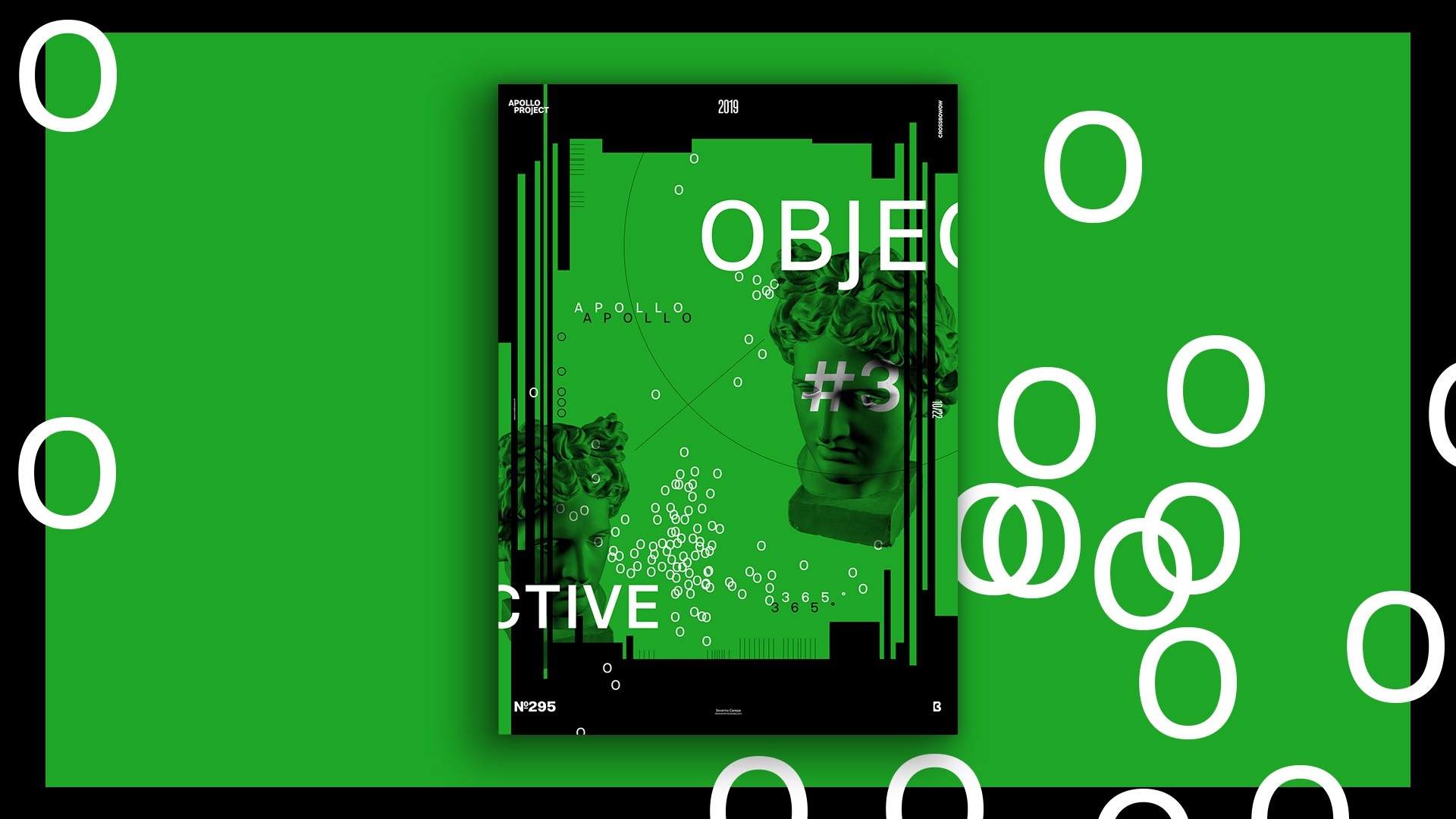
Another fun, early, and sunny morning was spent designing a poster. What can be more motivating and enthusiastic than waking up early knowing you will do what you love the most?
I know it’s difficult to answer, so I am glad to introduce you to poster number 295 of the mini-series Objective.
The Design

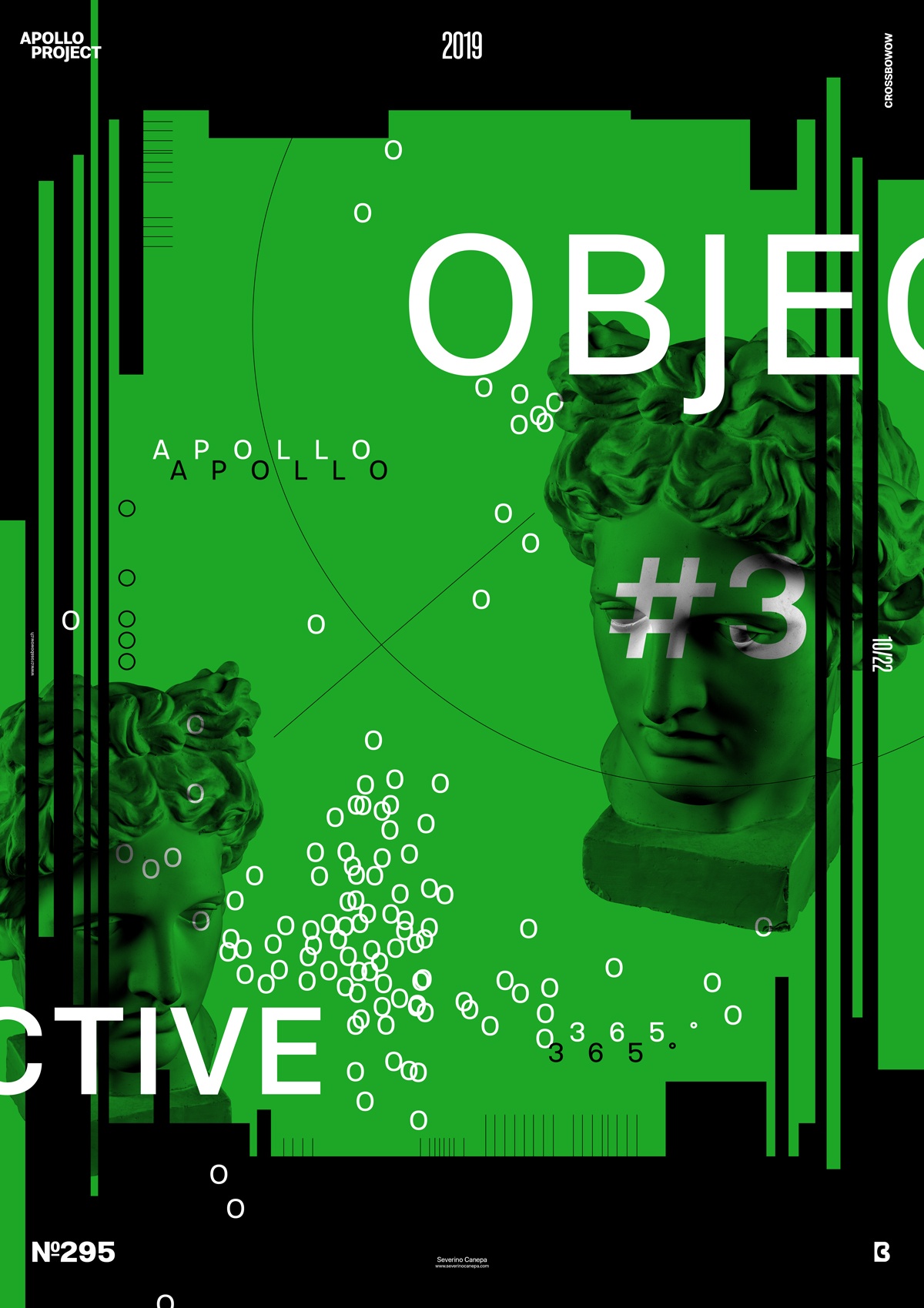
I used the same idea as the two previous posters: a black background and a large rectangle filled with a color. The color depends on the feeling at that moment. If I feel pink, I will use pink. The title, geometric forms, and the “O” letters are repeated and dispersed here and here on the canvas. I use them to create a path to the viewer’s eyes.
I play with a vertical line on each canvas side to generate dynamism in the composition. Apollo’s effect set under the Blend Mode Multiply creates an interesting effect with the green rectangle and the types behind its layer. It looks as if the font integrates and couples with Apollo’s shapes.
Speed Art Poster #295
Look at speed art tutorial 295, which I made, if you want to watch me work from start to finish. Don’t forget to hit the thumbs-up button and subscribe definitively, too! That helps me!
See you tomorrow for poster number 296, Objective 4! Have a nice day!

