I had difficulties waking up this early morning, but I did it, and the energy came gradually because of the motivation to do my stuff. I like that kind of morning, and the fact that it is Sunday doesn’t matter at all.
The Design

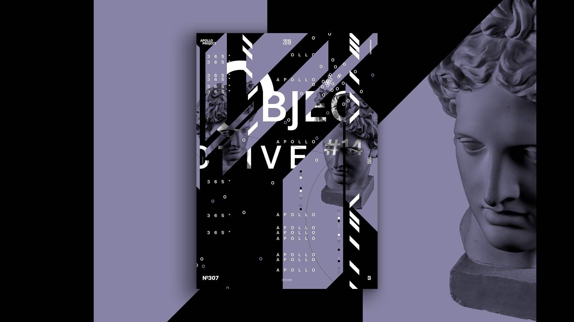
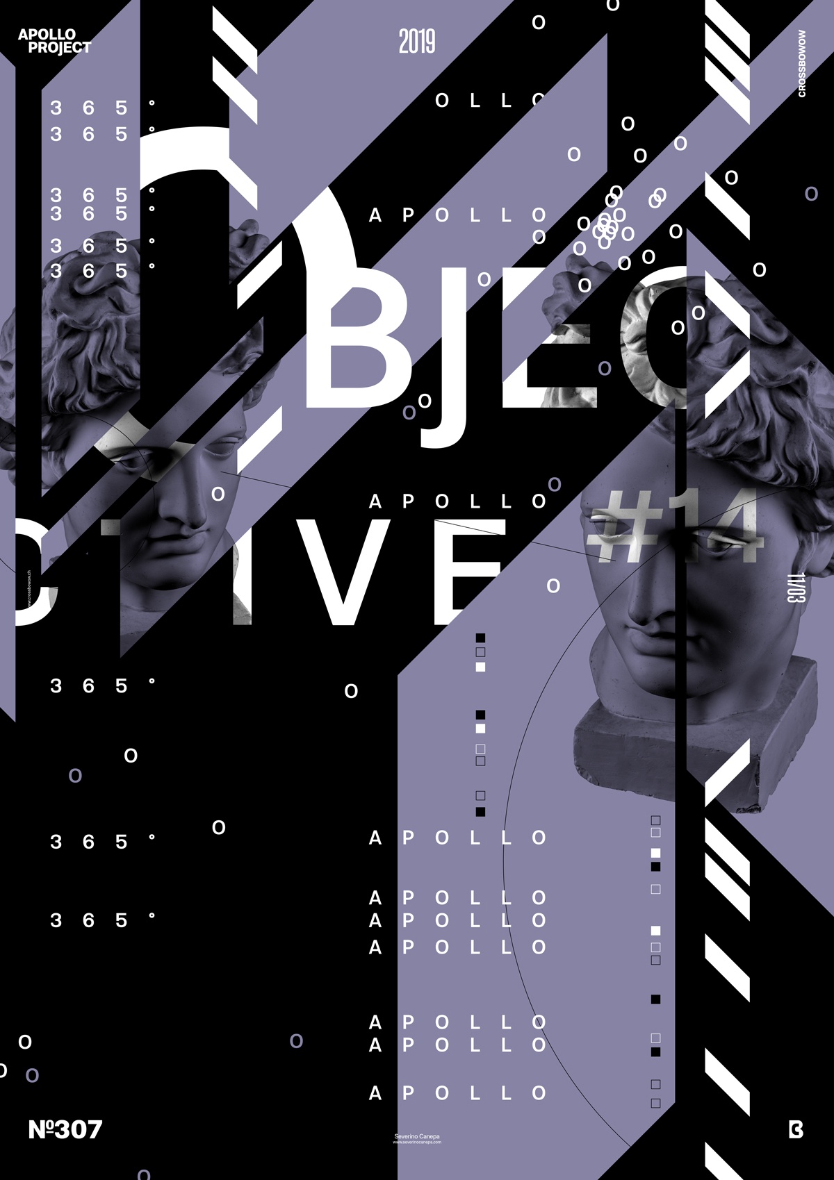
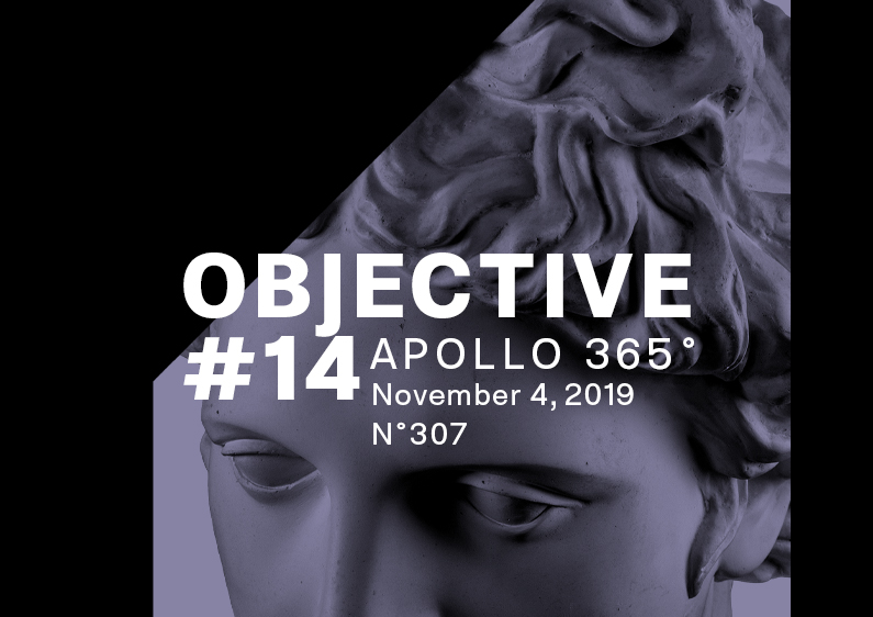
It’s the same concept as usual, so it becomes unuseful to talk about it now. I am playing more with the title sizes. For example, here, the letter “O” is much larger than the rest of the word “Objective.”
This is another poster that looks like a draft. That makes me think about designing a more complex poster with minor elements everywhere to see what happens.
The idea on poster number 14 of the mini-series Objective is to try to leave white space on the bottom right of the poster. I broke it with repetitions of the number “365°.” That also makes me think about Kern differently for each version of the numbers.
Finally, inspiration comes from everywhere, whatever you are doing. Writing that text gave me some ideas, and I hope to use them to create a better design tomorrow.
Speed Art Poster #307
It is not big news if you follow my work, but if you randomly arrive at my online portfolio for the first time, you may be glad that I created speed art video tutorial number 307! I recorded myself while working in Photoshop from start to finish.
Thank you for looking at and reading about poster number 307! Come back tomorrow to discover the Objective 15 Poster. Have a nice day!

