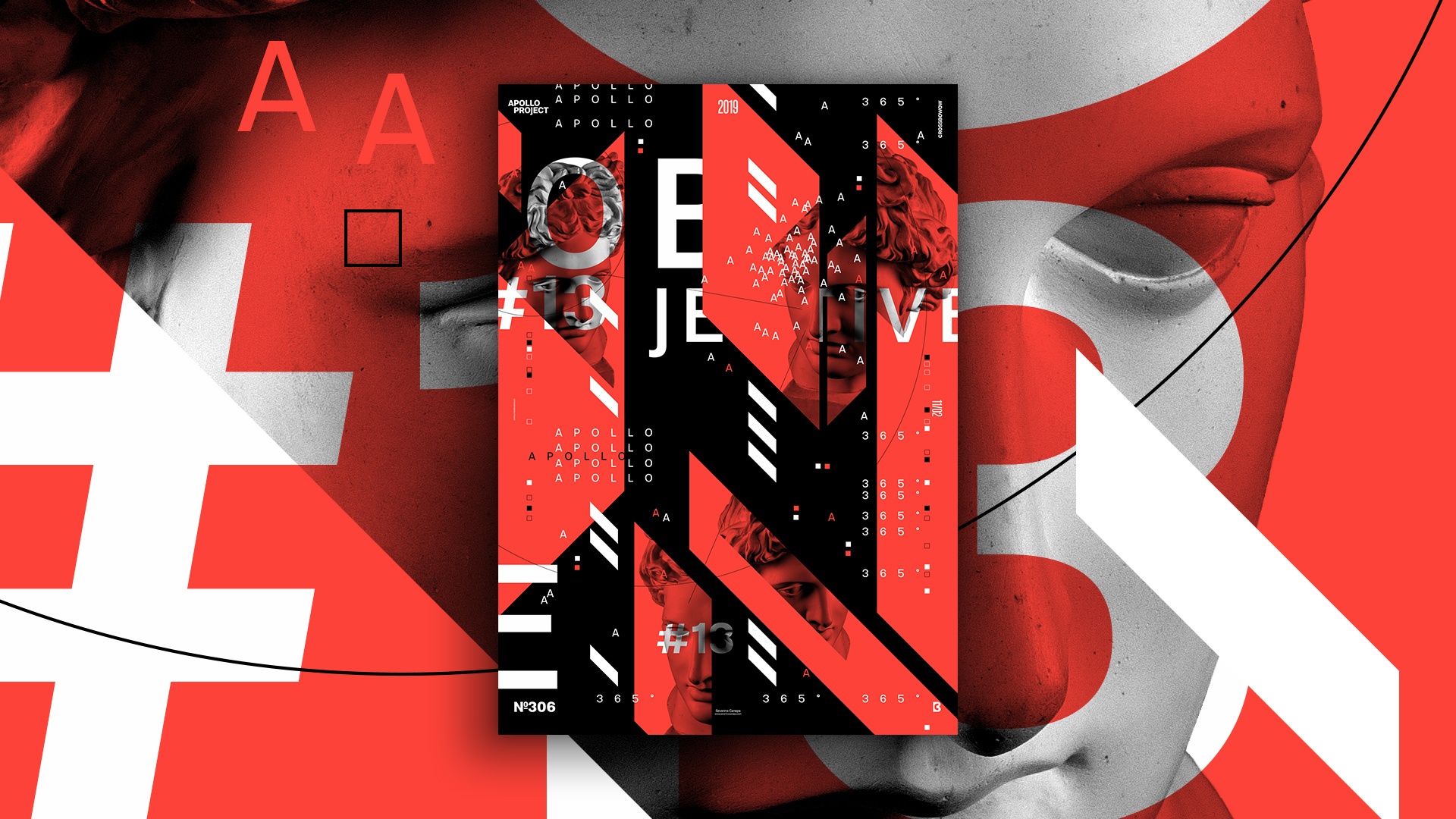
I slept a moment more this morning, and after that, I felt enthusiastic about designing a poster. As you know, life doesn’t always go the way we want; my daughter woke up and wanted to play toys with me. So, I started the poster later in the morning.
The Design

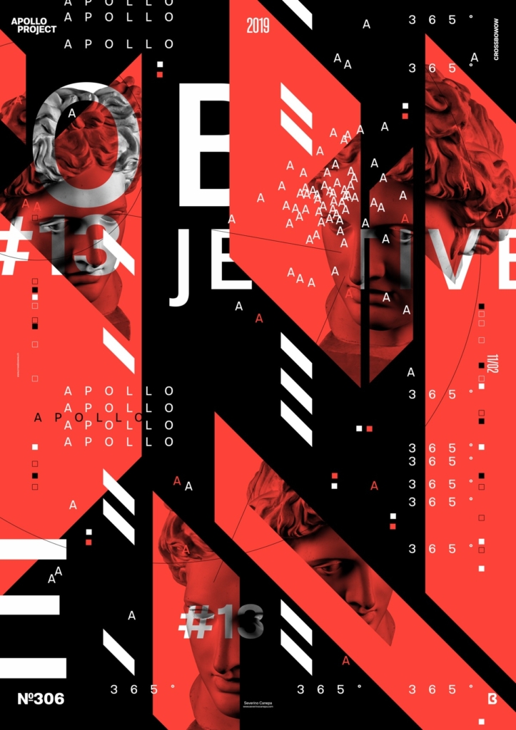
I promised a lot yesterday. I said I had good ideas for improving the miniseries and a clear visual vision. I finally only improved the design a little bit with some ideas. The design gets upgraded, but unfortunately, it is not a significant change. I added more pictures of Apollo and cut them with the same angles as the shapes.
Whatever my wish, today, I leveled up the poster’s design. It’s the same, even if it is only a little. It is expected to evolve when you do the same things repeatedly. Trying to search for a way to improve is an essential soft skill. Something that everybody wants? I think so.
Today’s design looks messy, and that makes its visual interesting. The viewer’s eyes are directed to the top left and right, with some steps on the bottom. I also feel that too much white space won’t work well with this type of poster.
Speed Art Poster #306
The improvement of today’s design will probably make the speed art video tutorial number 306 more interesting. Discover how I made the poster from start to end and give a review or a thumbs up. I appreciate it very much.
I’ll see you tomorrow for the Objective #14 Poster. Have a nice day!

