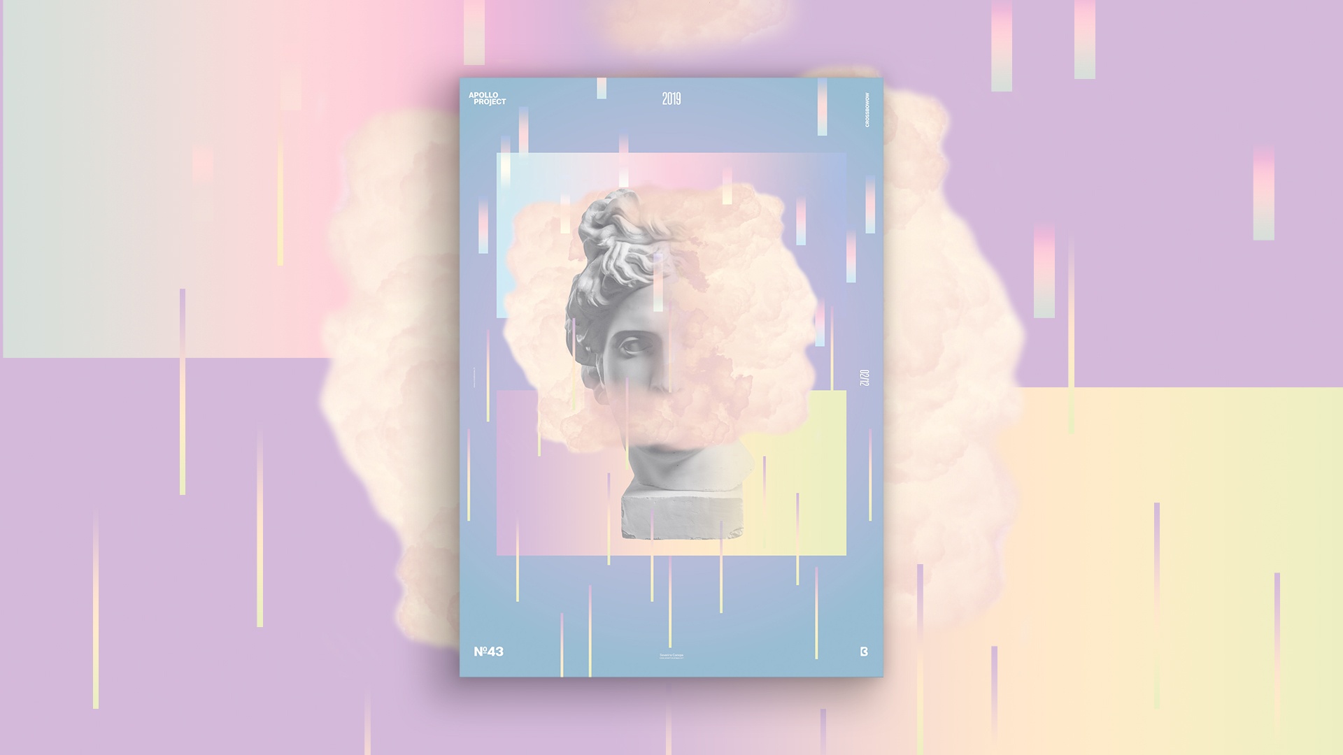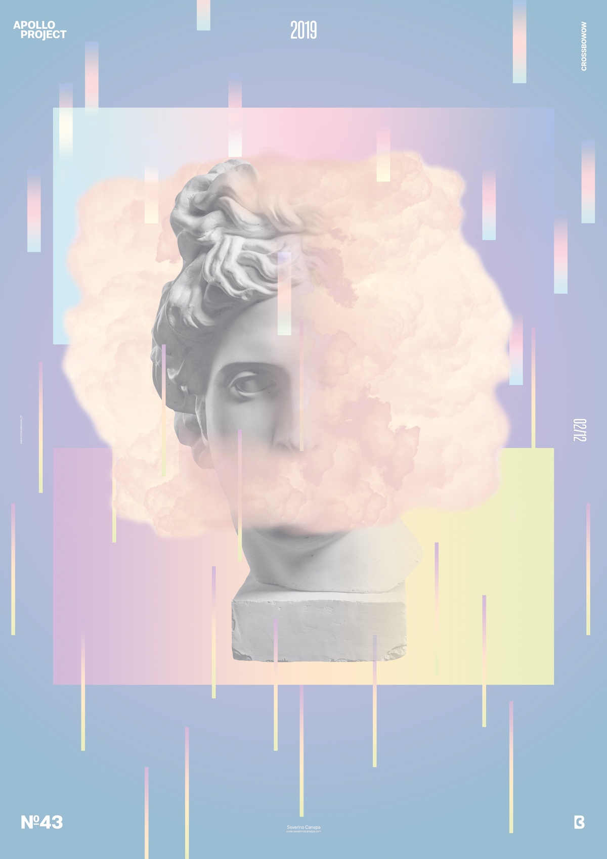
I am starting to appreciate to use pastel colors on my Poster Design. They look sweet and attractive, simple to mix together because of low saturation.
In the other hand, they look like a tasteless candy. They betray my bad use of color theories. It is also the less risky option because I am sure they will work together.
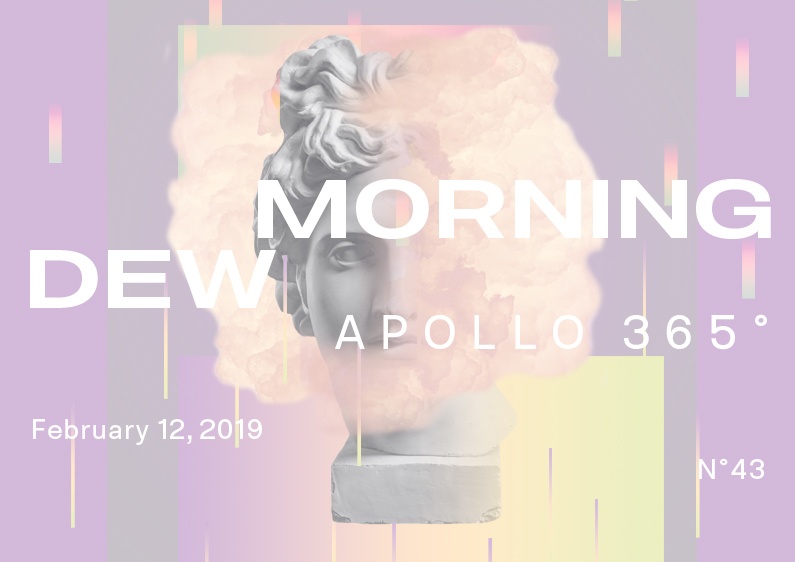
There is a moment that I wanted to use other pictures than Apollo’s head to play with on my composition. To create today’s poster I played with the picture of a cloud which surrounds the statue. It is not complicated to realize it but the visual effect is good.
I used two large rectangles on the background filled with different pastel colors gradient and many other thinners rectangles. That generates a stronger visual impact.
Morning Dew Poster Conception

Another Poster Design Speed Art Conception and it already is the number 43, so far so good.
Have a nice day and see you tomorrow for the poster number 44!

