A word about the Design
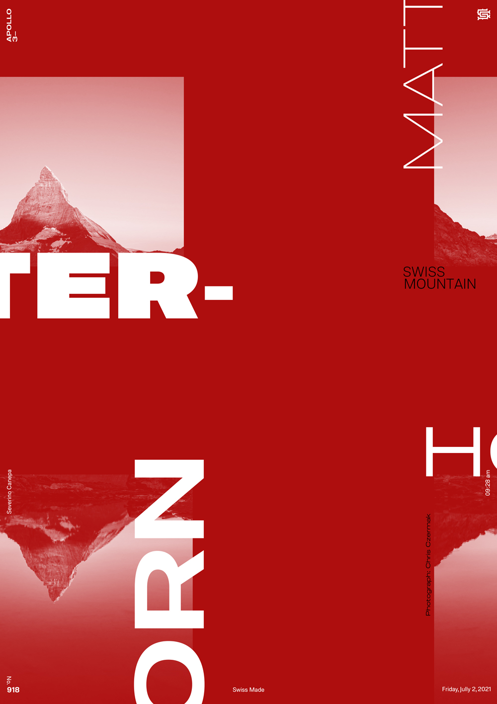
A good idea can sometimes be excellent in our heads but not good after being executed. I tried to let the Swiss cross between the images and play with white types to accentuate the idea. The final result is a bit disappointing because it looks much better in my mind.
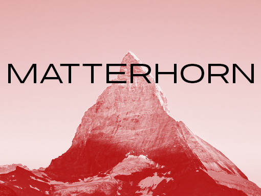
Photograph: Chris Czermak.

