A word about the Design
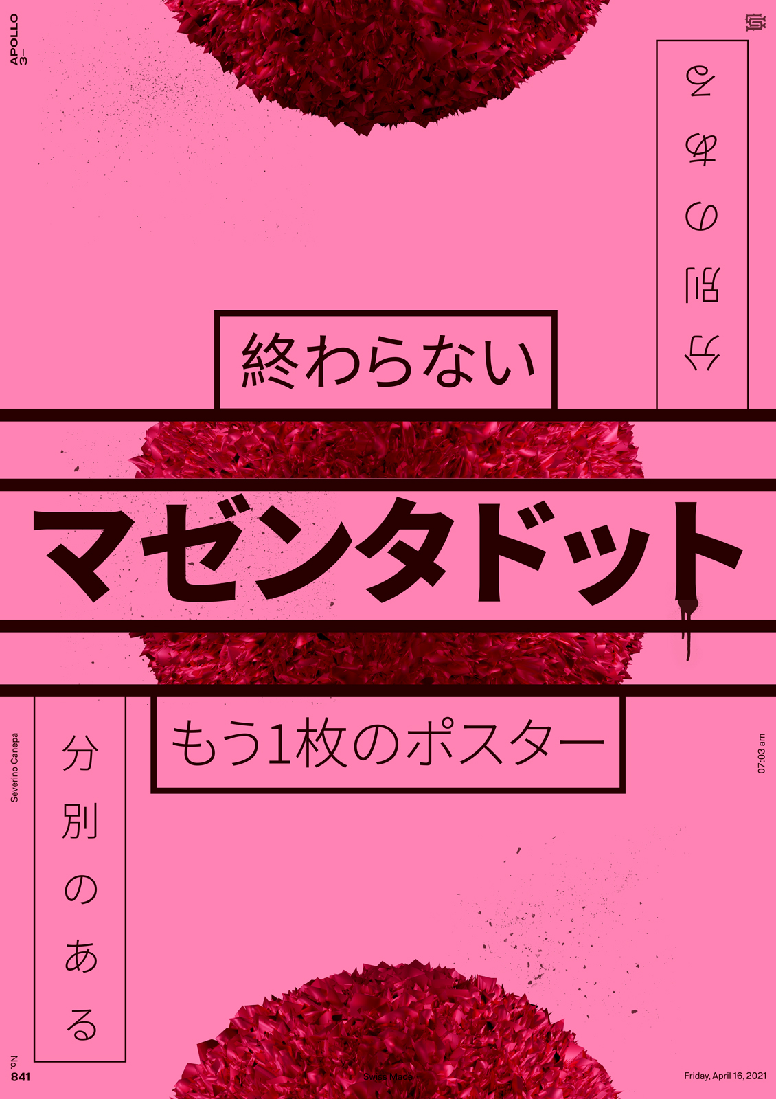
I recently participated in a contest for a festival in Switzerland. I have been a bit busy, so I overused the mini-series. They allow me to save my time.
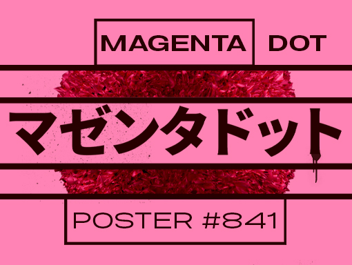
Today, I used a magenta color to deal with the poster and, as usual, Japanese typefaces and the 3D circular shape to compose a minimal layout.

