Wake up early is good! It isn’t easy, but it is possible with determination. It allows me to take the time to search for a picture and think about what kind of poster I will create before opening Photoshop.
The Design

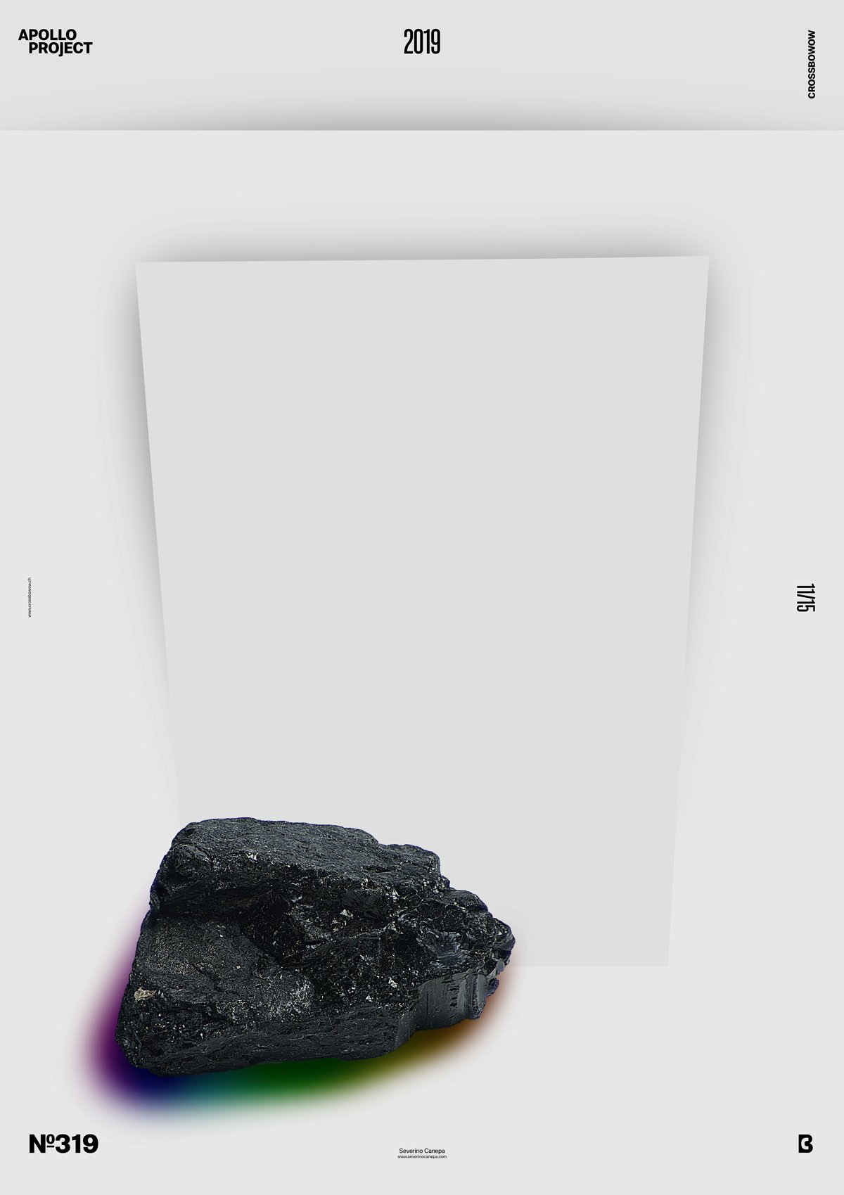
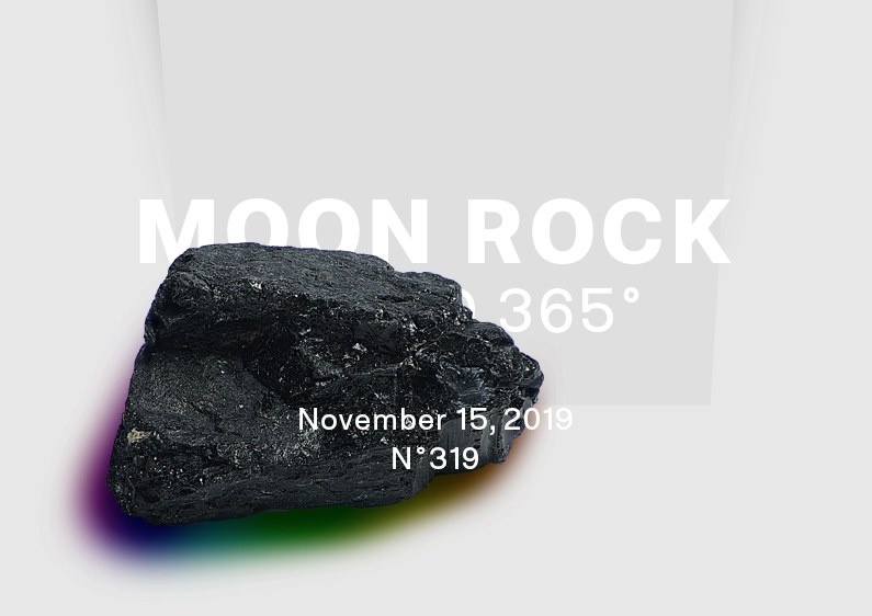
The global plan and idea for today’s poster involve using a picture of a rock—a black rock that made me think of a Lunar Rock, the reason for the design’s name.
With this goal in mind, I clipped the rock and imported it onto my canvas to start designing. I almost forgot to say that I didn’t want to use Apollo’s head, so I started by creating a shadow under the rock to make it look stable in the poster.
After that, I had the idea to add a colorful gradient under the shadow, as if the rock could emit shining colors.
That is the funny part.
Once I made the rock and the shadow, I noticed the design must be minimalist and subtle. The rock takes a lot of place, and its graphic qualities are consequent. I also didn’t want to break it by adding another unnecessary artifact. Firstly, I wanted to focus on the rock, and secondly, thinking about adding other elements would take me too much time without being sure to find something added in the end.
To finish the design, I added a rectangle on the top with a drop shadow effect and another rectangle with a perspective. That’s all for today.
Speed Art Poster #319
Here is the speed art video tutorial. One more time, I registered all my processes from start to finish so you can follow my steps.
See you tomorrow for poster 320. Have a lovely morning!

