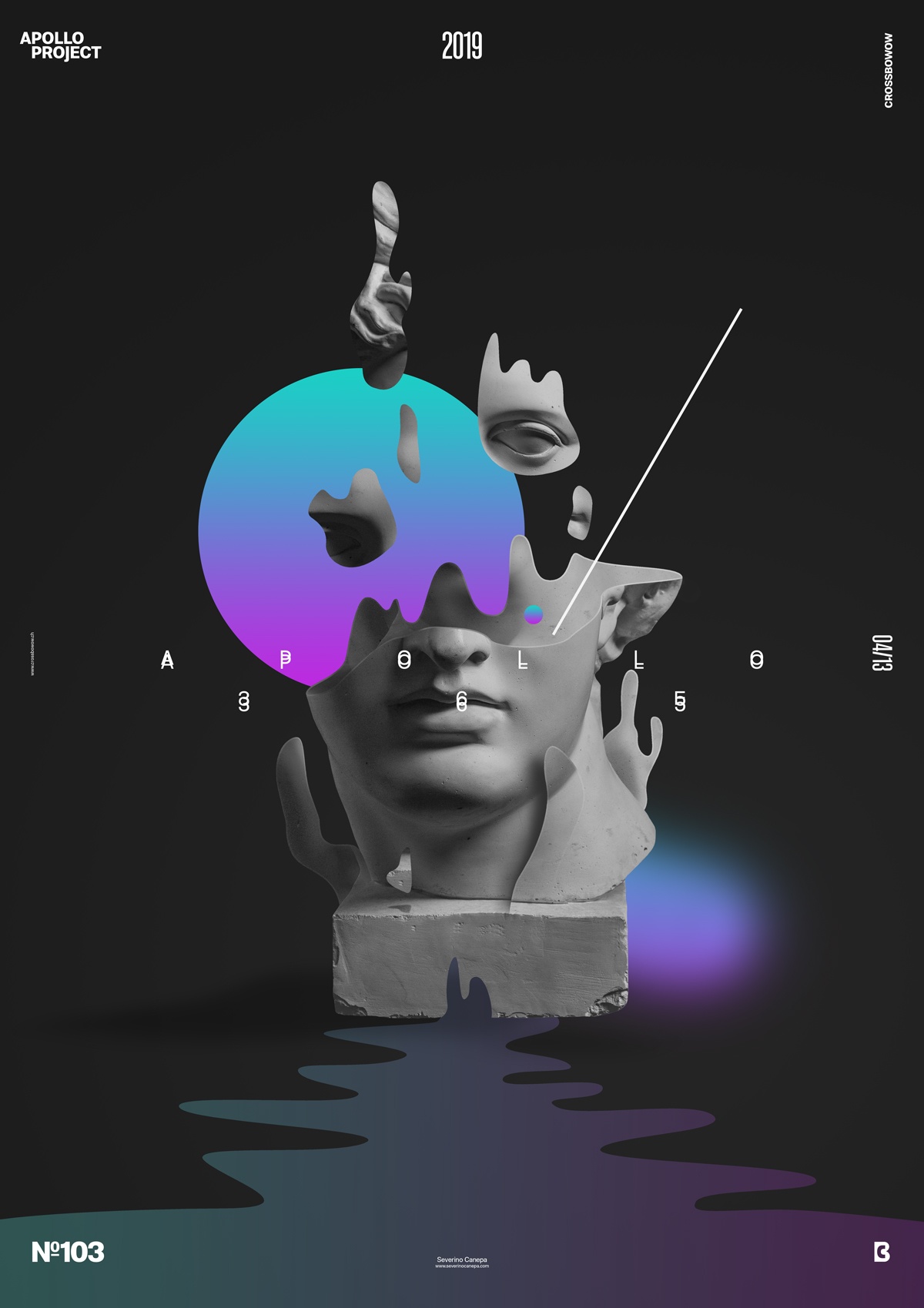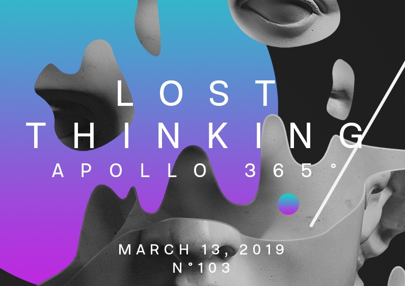
Today, I was inspired! I created a minimalist poster that almost speaks a poetic language. I think it is a sober, attractive, and intriguing design!
The design

As you noticed, I am particularly proud of this poster. Naturally, there are some things I don’t like, such as the liquid under Apollo’s Statue, because its color is too odd. On the other hand, it works better than the other solution I tried. It is also probably not obvious, but I used the same theme as yesterday’s poster, namely Apollo’s dreams, and the same gradient colors.
I started by cutting inside the statue and creating its behind shapes as if some pieces were floating. I used this idea on the pedestal and other detached parts on the top. I finally added a circle on the back, a line, a run-out liquid, a blurry form, and the font. That’s all for this creation.
Self-Esteem Speed Art Poster #103
It was a fantastic day designing poster number 103, and I hope tomorrow will be as good as today. I made a time-lapse video about the poster creation process, and I hope you will enjoy watching me work on this creation. If you can, bring some inspiration from it!
Have a nice day, and see you tomorrow!

