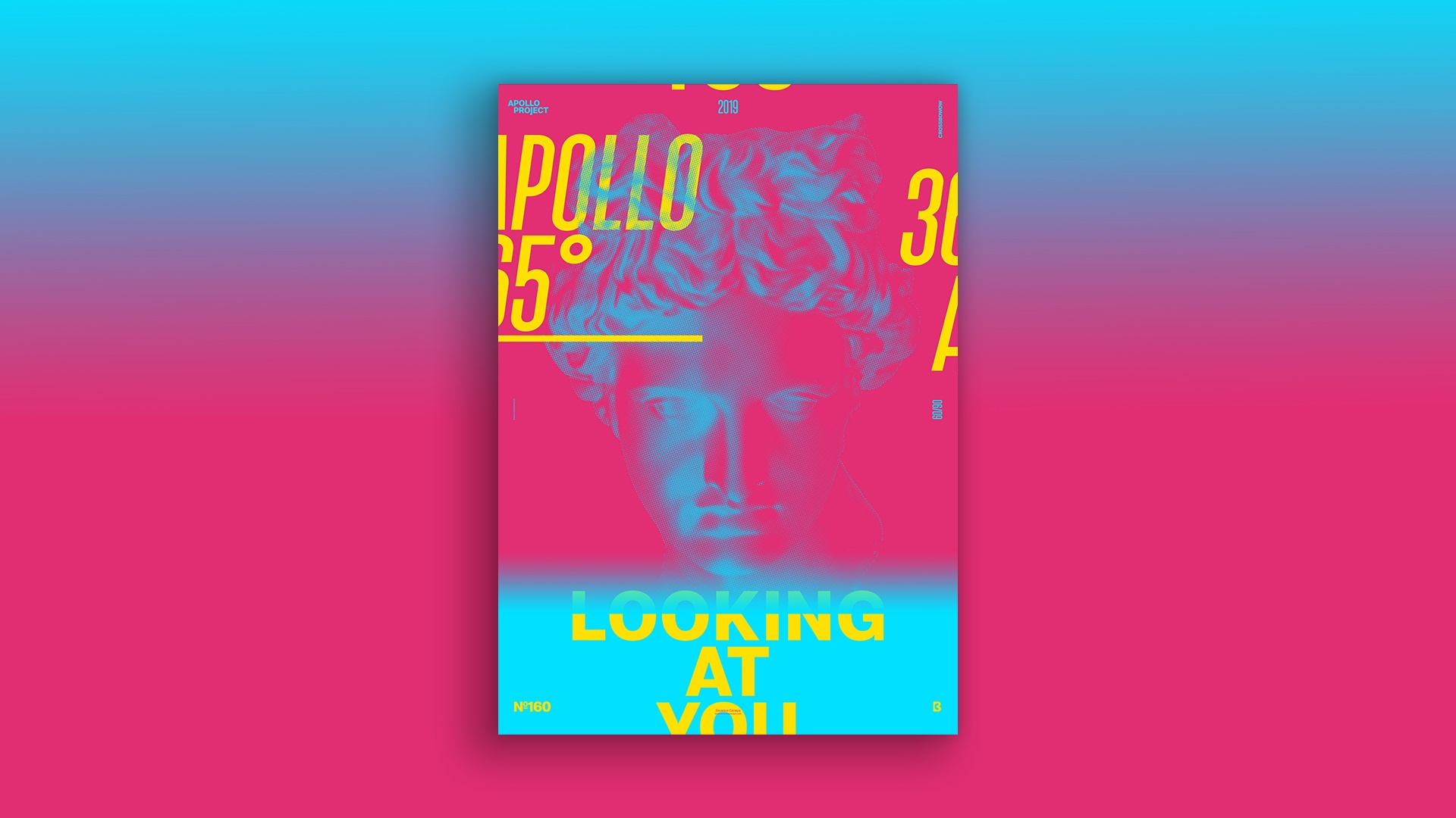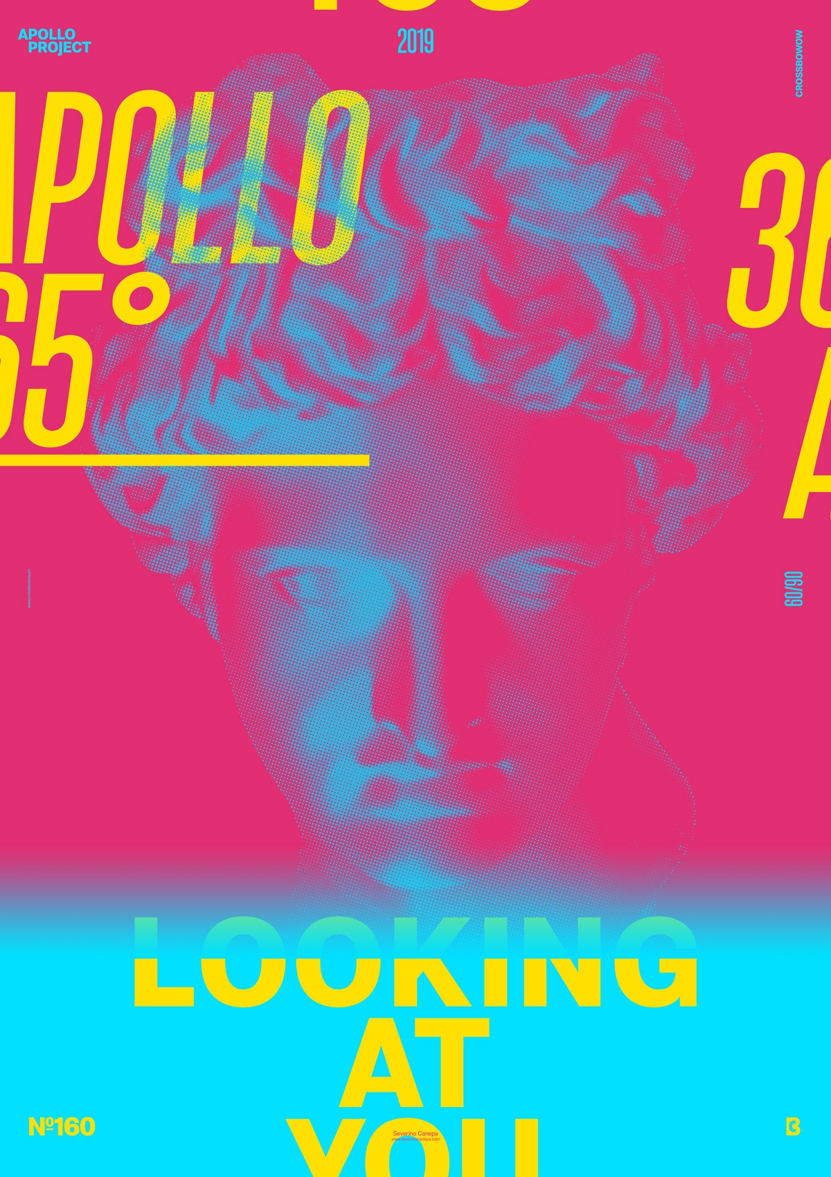
Another minimalist and typographical poster is made in a bold style and halftone with vivid triadic colors.
The day goes by too quickly, too fast. There are days like those. Time flies when you are captivated by what you are doing. And when you realize how much time you spend on it, you know you won’t catch that time back. Whatever, this is time well spent.
Unfortunately, it wasn’t for today’s poster. Instead, I was designing a book for an artist. I am hurrying to finish it, see the book printed, and introduce it to you.
The design

The colors are so flashy and vivid that they told me I won’t like them anymore next week. I feel I will hate them as much as indigestion. No matter what happens next week or today, I like them. I was about to set a vintage cream color as a background, and I finally changed my mind for the better.
I quickly came up with these vivid colors and started by modifying the picture of Apollo to a Halftone image in the Filters options. I selected and removed the white colors the filter allowed. I invertedthe selection and painted it with a giant blue pencil.
Then, I started to play with typography and searched for a better font variation. I chose a compressed italic version for the poster’s dynamic appeal. Later, I arranged the text to look good.
Speed Art Poster #160
Watching the Speed Art Video won’t take you a long time today, and there is no complex skill that you can learn. But who knows? Maybe you will learn something from the process.
Have a nice day, and see you tomorrow for poster number 161!

