I am in a hurry to finish this poster mini-series. I am getting tired and upset about them. Or maybe it’s because I feel like I am in the worst of the storm about the design challenge these days.
The design
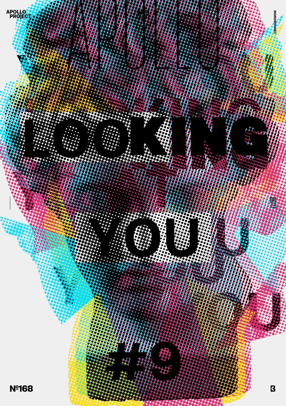
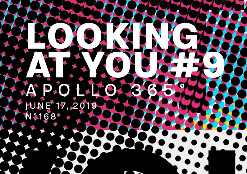
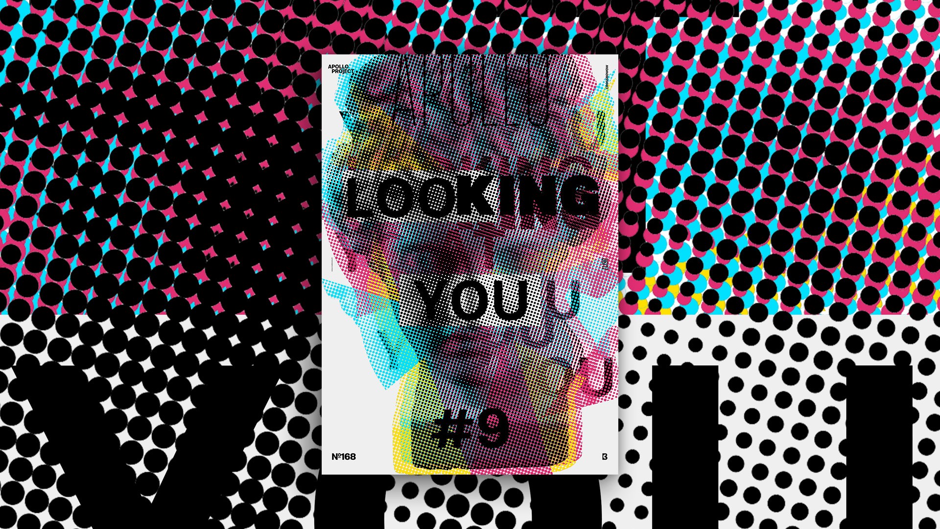
Today’s design looks like garbage because it is grunge! After designing it, I realized that the font in the background doesn’t look straight. It is only a visual effect generated by the dots. The font is straight.
I tried to create a glitch effect, which ended up grunge, a busy visual effect I finally learned to like. Putting font behind the Color Halftone Image was a good idea because that produces visual tension and depth. I also added white rectangles behind the dotted image of Apollo to give a focus and a game of words in “Look” and “King.” What’s a big deal!
Speed Art Poster #168
Again, you can watch the “making of” today’s poster in video #168 and try to get inspired by my process. Have a nice day, and see you tomorrow for the number 169!