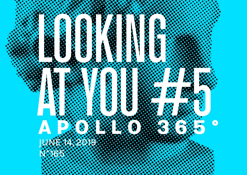

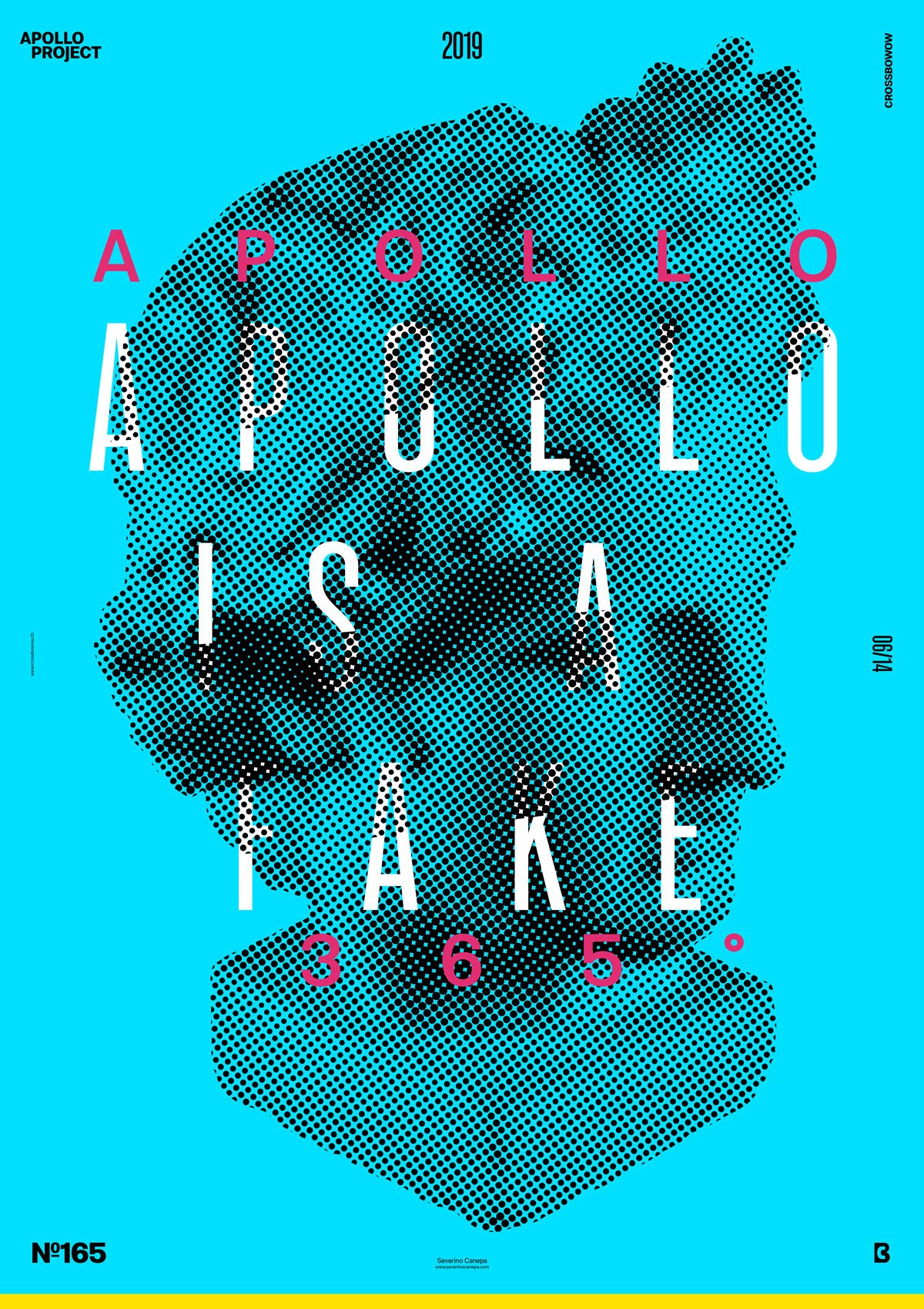
Here is poster #5 from the mini-series Looking at You, which was made with CMYK colors only.
The design
If you follow my work, especially this mini-series of posters, you are starting to get familiar with the style. You also probably noticed how I try to create different design variations for each style.
To realize this poster, I wanted to be as minimalist as possible. I generated a new version of Apollo’s head with different settings of the Filter Color Halftone. The dots are more prominent now. I placed a compressed variation of the font and a regular, bold version together and arranged them in the center of the canvas. The original touch of this poster is that I duplicated the font layer above Apollo and cut part of the upfront layer.
Speed Art Poster #165
Do you like the poster? Check Speed Art Video #165 to learn how I did it and maybe, with some luck, get inspiration from it.