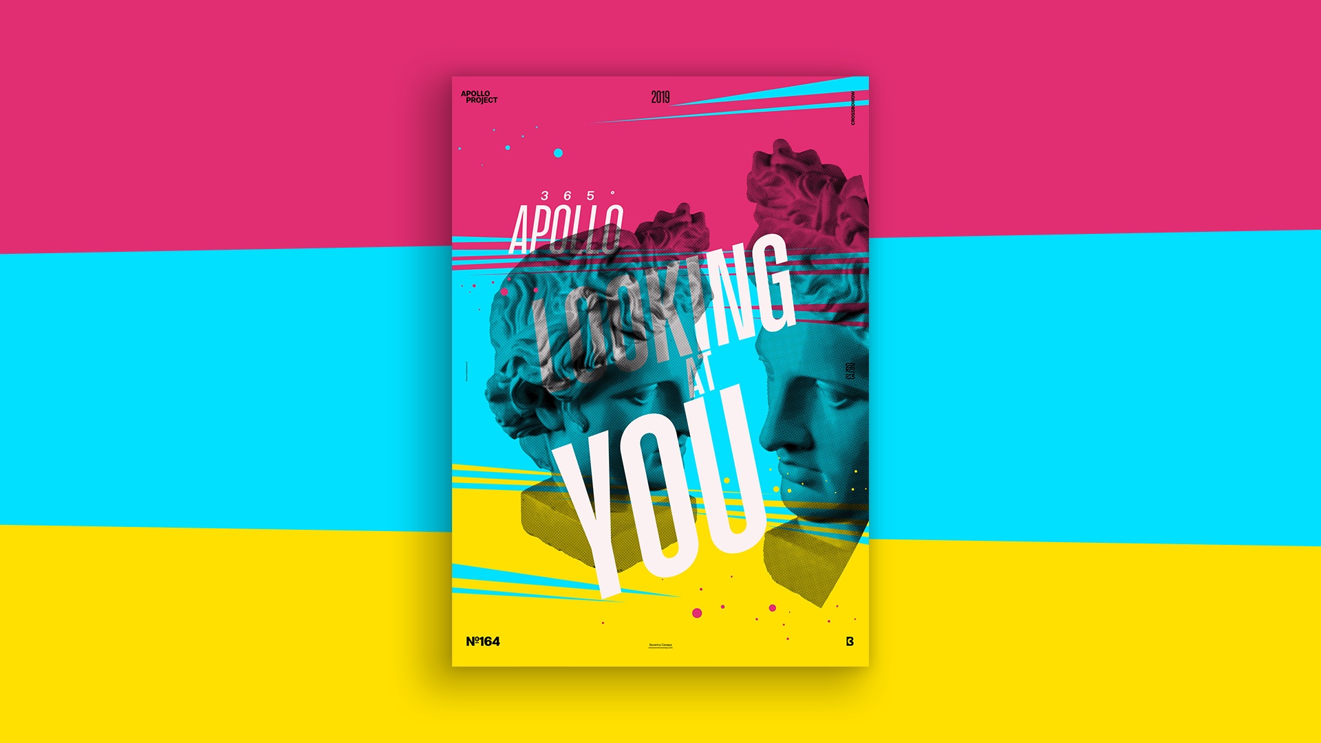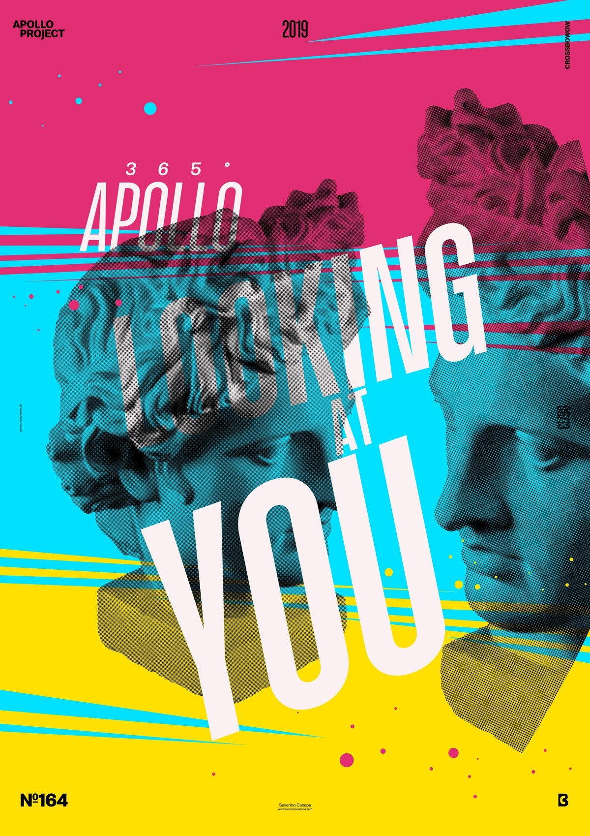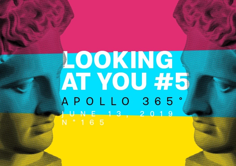
This is poster number five of the mini-series Looking at You. This time, I made it with colors as a background.
The design

This is another CMYK color design without a Key Black background. I sometimes like to change things up and experiment with many different implementations of my graphic elements. I want to see how they work, interact, and play with the contrast.
Today, the poster is dynamic because of its intelligent shapes and the italic typography, accentuating the effect. In addition, the circles I added give a direction to the shapes and the viewer’s eyes, generating movement from left to right all along the canvas.
Speed Art Poster #163
I have created Speed Art Video #164 every day since I started designing posters for Apollo 365°.
See you tomorrow for the poster #165!

