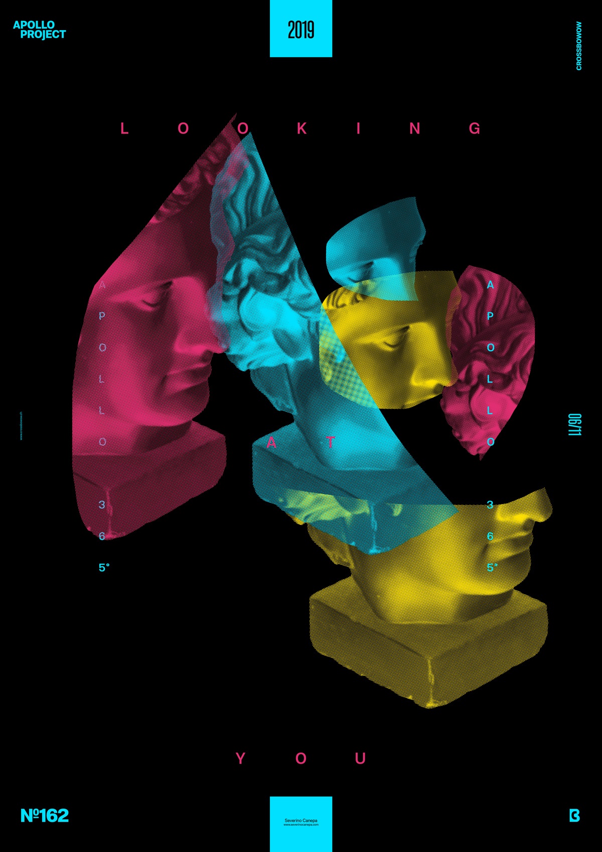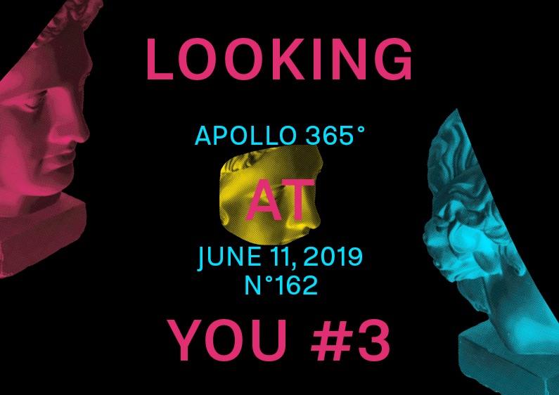
Poster Design Number Three of the mini-series “Looking at You” uses CMYK colors and the Photoshop filter Color Halftone.
The design

It has the same style of images and typography but a different mentality and application of these elements on the canvas. Today’s essential touch is about cutting into Apollo’s Picture — made with the option Color Halftone. By doing that, I created more space and allowed me to play more with other elements and colors. I also made the viewer’s eyes curious and excited about what was happening in the poster. Simple and effective.
Setting the background with the Key Black color was a good idea because it exposed the intensity of other colors. I quickly found where I could put the pictures and typography. I used my instinct, and here we are.
Speed Art Poster #162
Another Speed Art Video # was made while I was working. Please take a look and tell me what you think about this design.
I see you tomorrow for poster #163!

