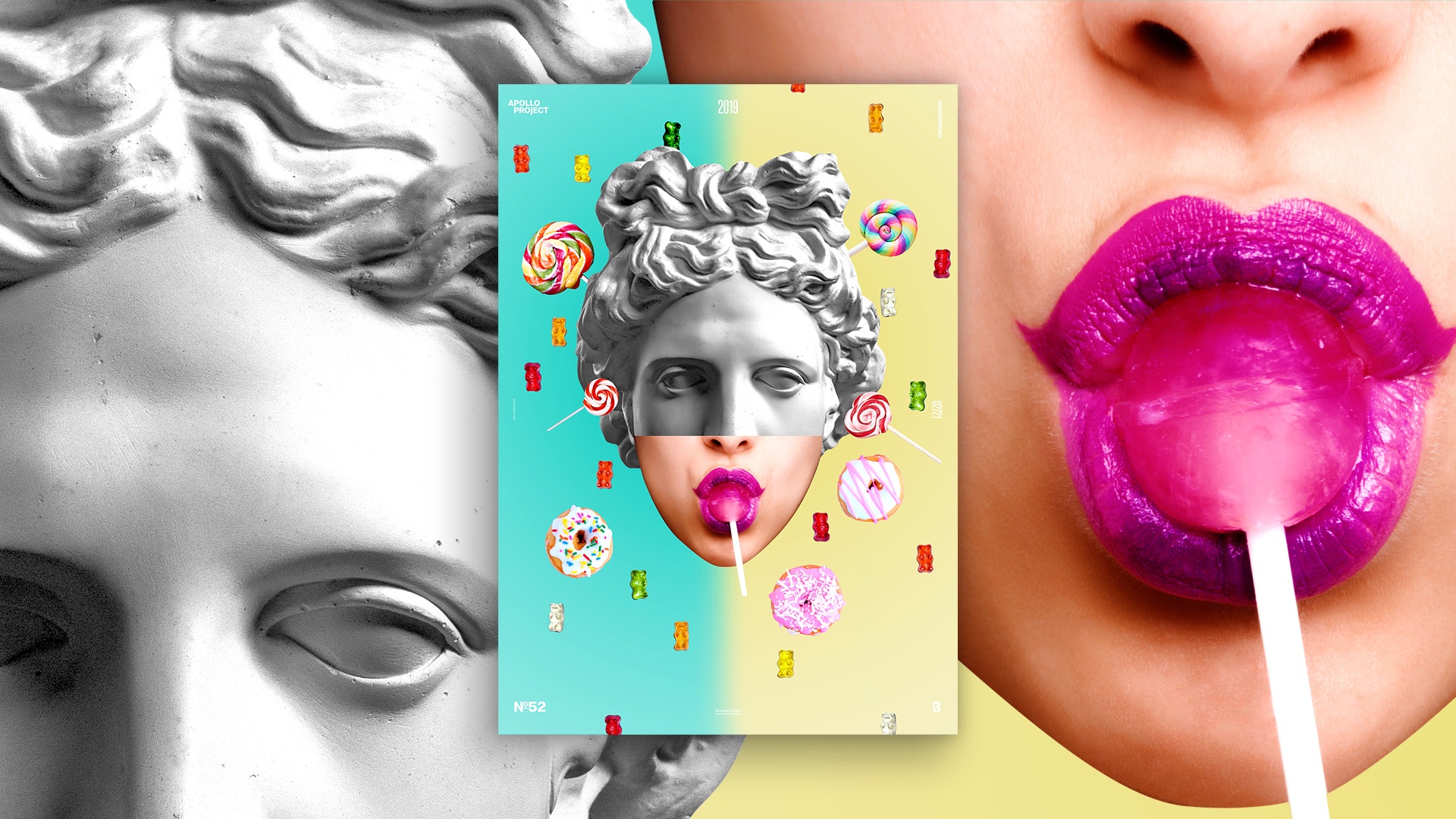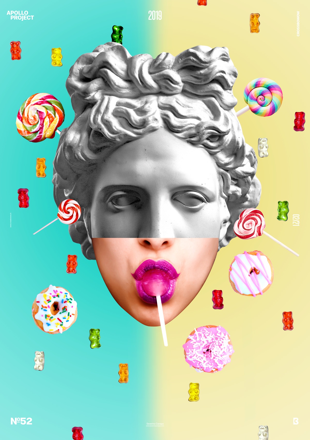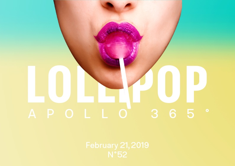
The February 21st, 2019, Poster Design is about Candy, Donuts, and Lollipops. It’s a sweet and fun poster that sweeties’ envy will consume. As you can notice in the Speed Art Video, I finally explored many options to obtain this result.
But I am still thinking about the background colors. Should I use darker colors? Are red and yellow pastels better? I feel the green contrasts better between the background and the other elements. That makes me think it was the right logical choice despite my heart preferring red.
I am proud of the girl with the lollipop in her mouth. It is the best image combination with Apollo’s face. Not only because they perfectly match together but also because it is a funny and trendy mix.

Lollipop Poster Speed Art
This was a yummy poster design, and I had much fun with it!
I believe you can feel it in the making of the video right aside. See you tomorrow for the #53!

