About the Design
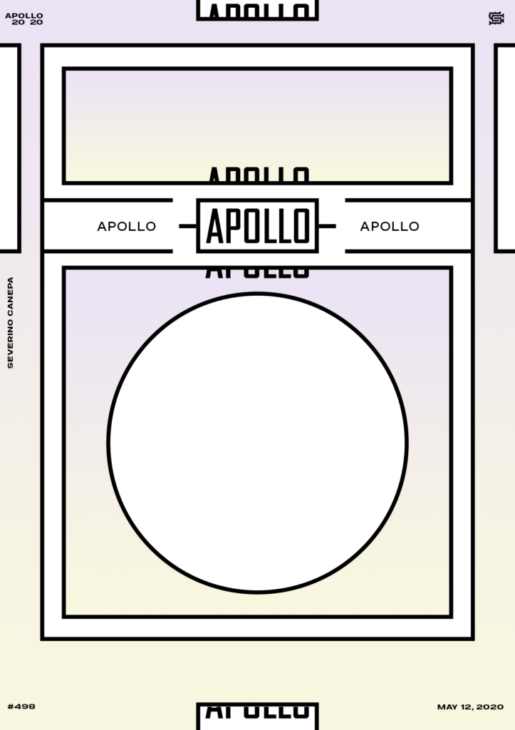
This is one more poster made with geometric shapes and a thick black outline, and filled in white or with an iridescent gradient from light yellow to light Lila. It is simple and minimalistic, and I like that style.
What else can I say? It’s like usual with mini-series: trying slight changes, creating a new composition, using the same elements or not, changing colors, finding new ideas, mixing them, trying to go further, thinking it, overthinking it, and so on.
Speed Art Video Tutorial
Video number 498! It was a short video because I made the poster very fast.
Remember to come back tomorrow to discover Hyper Structure #5! Stay home, take care, do something you enjoy, and see you soon!
Music Credit
I will use the track Raw Space, made by The Whole Other (YouTube channel), during the mini-series Hyper Structure.

