About the Design
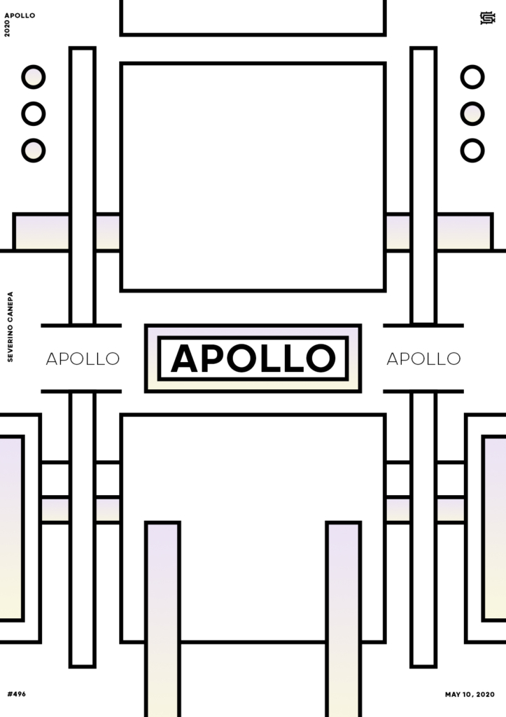
To create yesterday’s posters, I based the shapes asymmetrically. I based it on a symmetrical design today because it worked well on the first poster realized for that mini-series.
It looks like a little detail, but it is crucial to understand. A centered design based on symmetry makes that kind of poster look much better. As you know, I am experimenting and trying to play around with my elements.
Speed Art Video Tutorial
Do you like the poster? You will enjoy watching the creation process of the poster!
I see you tomorrow to discover Hyper Structure #3! See you soon, and take good care of yourself!
Music Credit
I used Raw Space one more time to accompany today’s video with a song. The track was made by The Whole Other (YouTube channel).

