About the Design
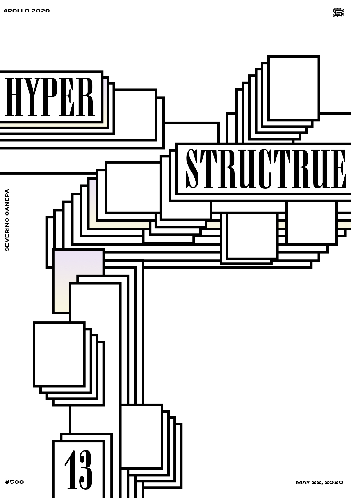
I like the layout and the style of today’s poster. There are empty spaces in opposition to more complex areas made with the superimposition of the rectangles.
I used the same serifed font as yesterday because it contrasts with the straight strokes of the rectangles. They match well according to my taste.
I am not improving the mini-series these days. I think I will stop before the number 20. Who knows? Maybe tomorrow, I will find a good idea to play with and enhance the design of this mini-series.
Speed Art Video Tutorial
Want to know how I realized this poster? Like the design?
Take a look at the video below. By doing so, you will discover the whole process of my design from start to finish.
Tomorrow, I will design Hyper Structure number 14; stay tuned! Have a nice day, and take care of yourself.
Music Credit
I am still using Renegade Jubilee, made by The Whole Other (YouTube channel), for the video tutorial.

