About the Design
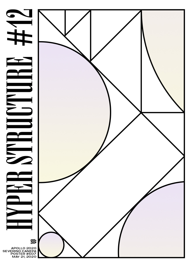
Yesterday, 20 May, I said I would improve and find a way to enhance the mini-series. I believe I did so with poster number 12 of Hyper Structure. It is once more a minimalist creation that works very well with constructing the geometric shapes inside the large rectangle on the left.
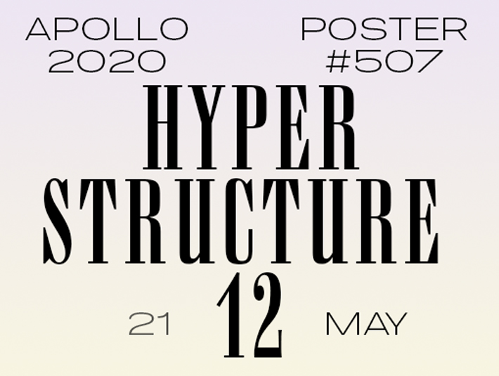
I used the pen tool inside this large rectangle to create lines and a kind of composition into composition. It looks like an Art Deco style or stained glass from a church, as you want! Some hours after finishing the design, I noticed I should improve the small paragraph on the bottom right. It needs more space between the lines and should come in a thinner font version. Except for that, I like the title’s font; it brings a dramatic feeling to the poster, which is welcome with this style in this particular case.
Speed Art Video Tutorial
I thank you for your fidelity and your interest in my work! There are always more people looking at my work and writing to me. It is awesome! I invite you to criticize my works with the well-known ones I like or don’t like, significantly if you can bolster any reason why something works or doesn’t work well in your eyes.
Come back tomorrow to discover what Hyper Structure number 13 will look like. See you soon! Take care of yourself regarding the Coronavirus, and have a nice day!
Music Credit
I still use Renegade Jubilee, made by The Whole Other (YouTube channel), for the video tutorial.

