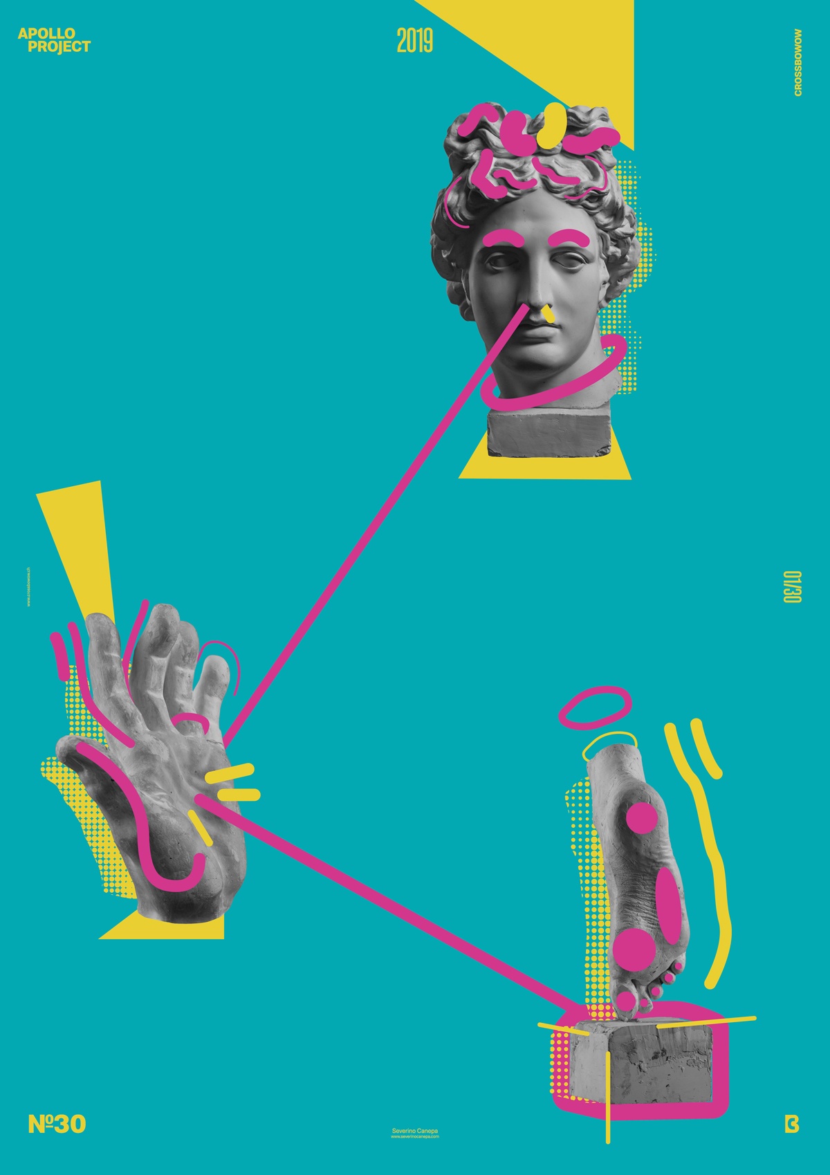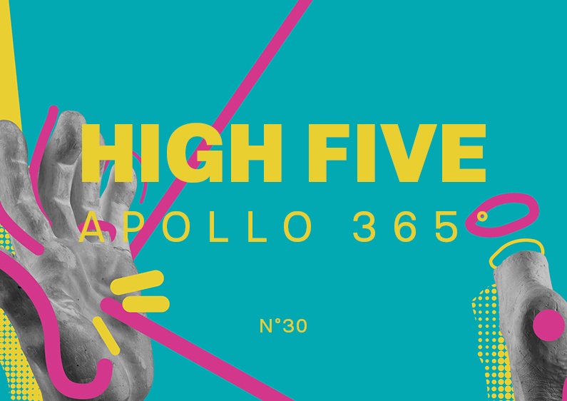
To spice up my poster design a bit, I bought some new, fresh pictures. You already saw the foot, and now I’ve added the statue of a hand.
About High Five Design #30

The two new pictures inspire and motivate me for this “everyday poster design challenge,“ I hope you can notice it on my posters.
I was about to use a dark forest green as a background but finally chose much brighter colors because they correctly express the fun of the elements. The elements around the statues are playful and look naughty. They deserved this high-saturated color.
High Five Conception Making Off
The most challenging thing in design is to keep things simple. The man who said that is right.
For Poster number 31, I will slow down the video speed. I am starting to think that the people watching them must feel dizzy.
Enjoy! See you tomorrow for the next poster.

