Another early wake-up. This morning was difficult because I played basketball yesterday. I played alone and ran with my ball from one rim to the other.
If you are interested, my elbow is getting better these days. It hurt a lot before.
The Design
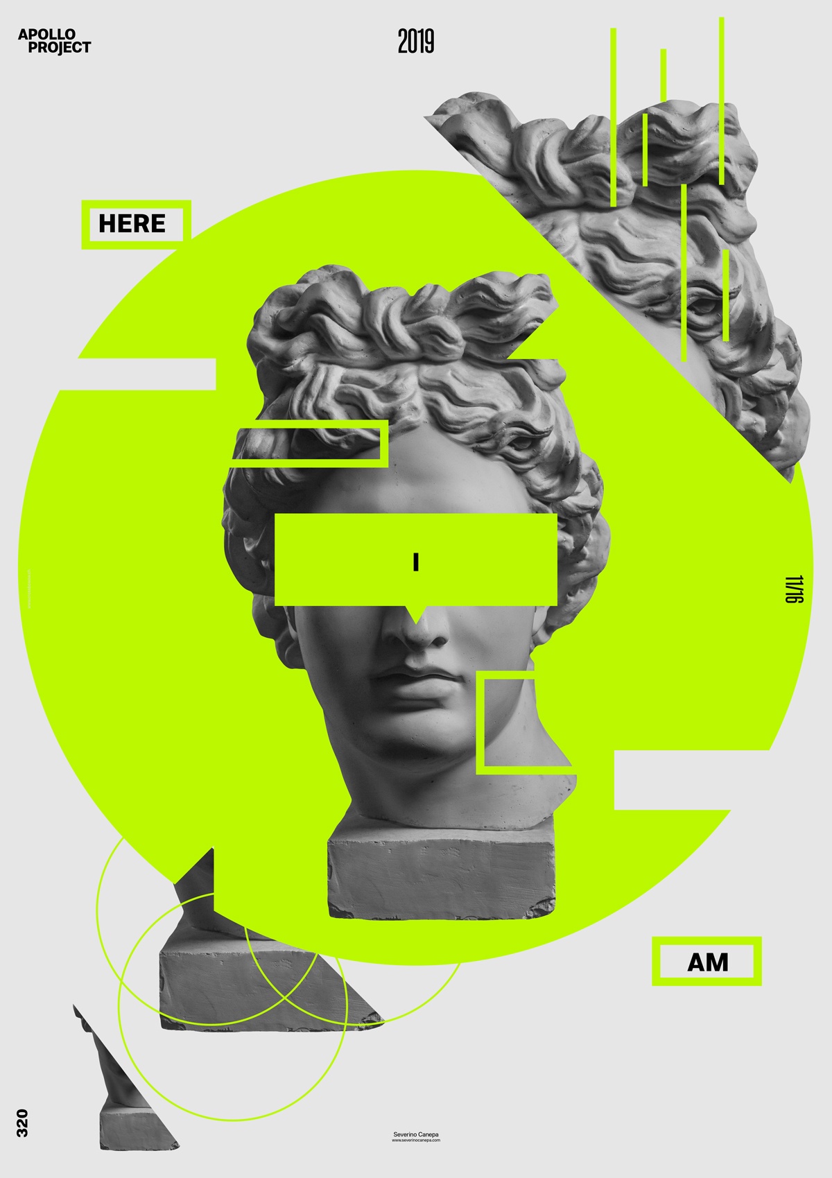
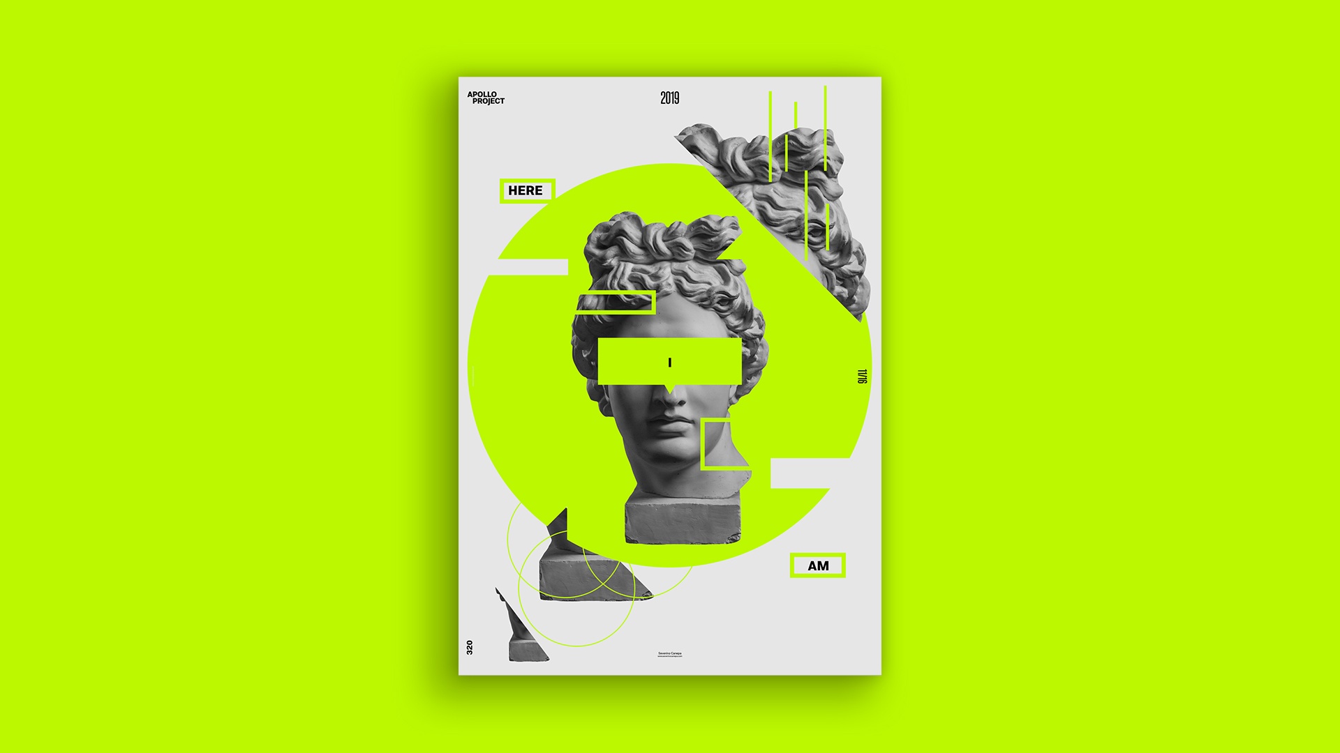
I wanted to use a bright color to create today’s poster. I selected a vivid green for the poster elements, black for the types, and light grey as the background. Apollo brings the most contrast in this poster. I took the risk or the lousy idea of not giving too much tonality difference between green and light grey.
I intuitively arranged the elements in the canvas. I didn’t know how to place them, but I made it naturally during the ideas that came to mind. The poster could look like a minimalist design, but I don’t think it is one. There are too many elements to be a minimalist.
I am happy with the overall look and feel of the”Here I Am” poster. After making it, I should add some light shadows on the green elements to make them appear better. However, the placement of the types, Apollo’s picture, and the geometric forms are good.
Speed Art Poster #320
Here is another speed art video tutorial about the Here I Am Poster. Please take a look at the video. It is concise. The poster didn’t take me a long time to design. Thank you for coming to my website. Come check out Poster #321 tomorrow to see what it will look like. Have a nice day!
