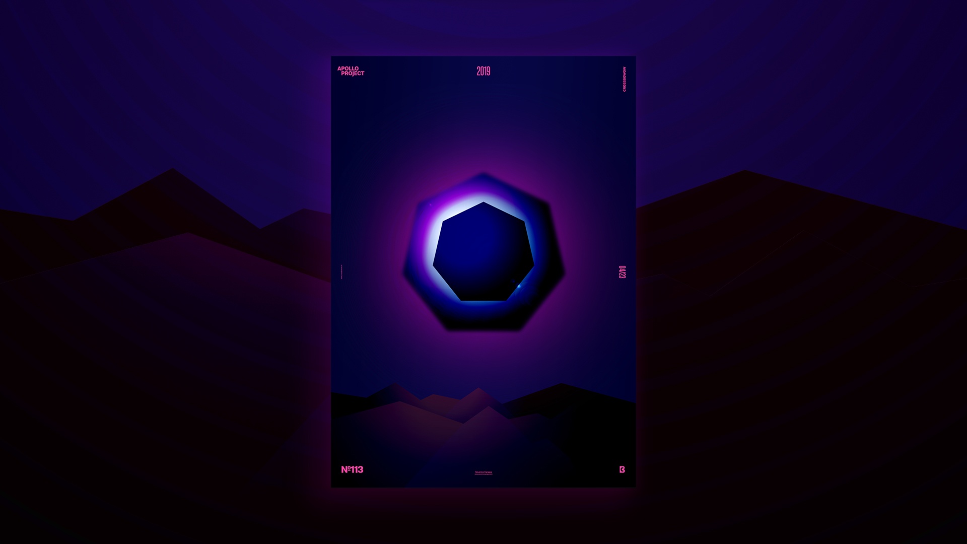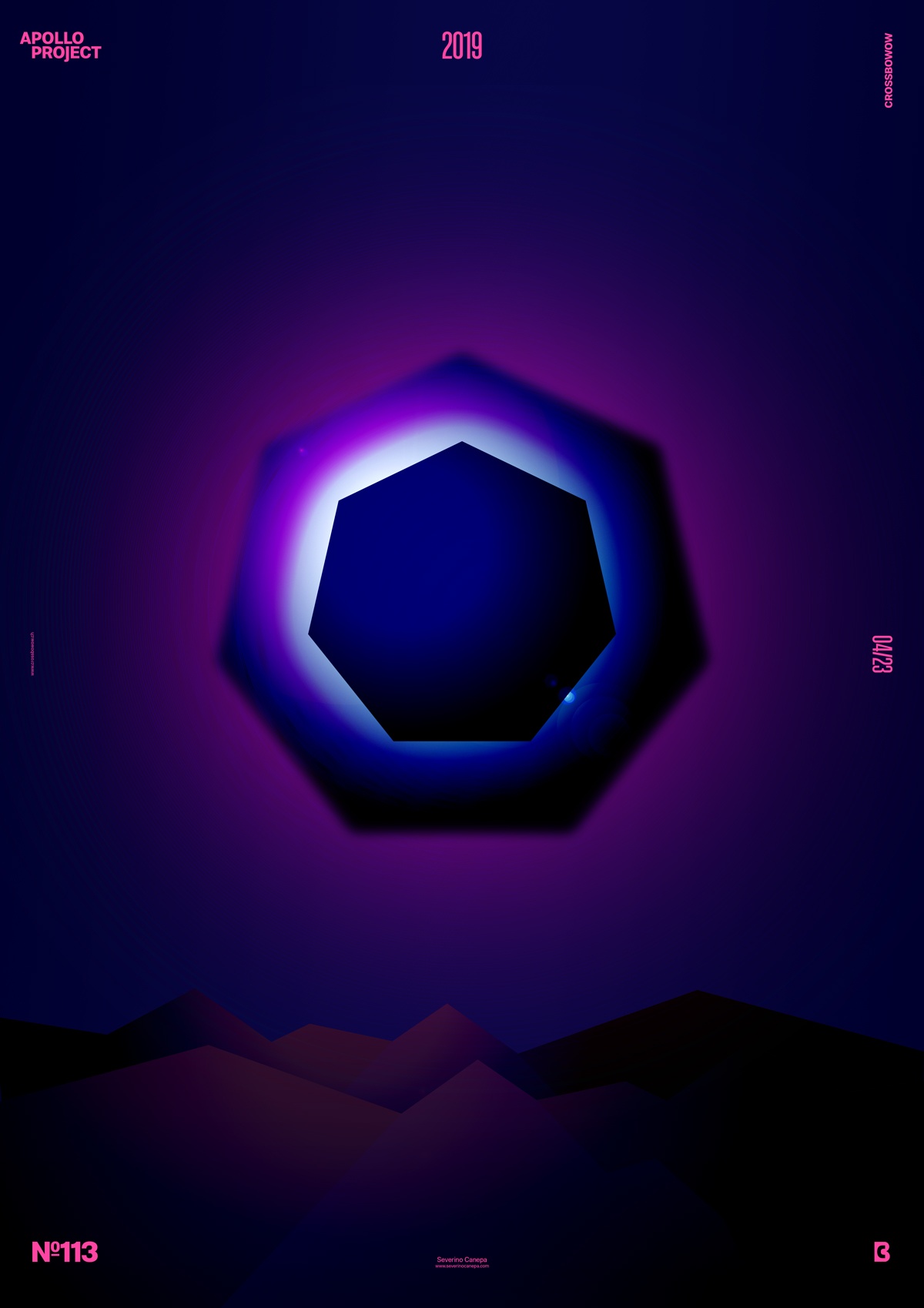
Poster #113 is a lighting effects experimentation and geometric-based design made as a landscape.
The design
The design is relatively simple. The hard part of the poster was finding the idea and the ideal blend mode to apply on the correct layer. If you follow my poster design challenge, space and the universe have attracted me for a long time. That is my never-ending source of inspiration, and I am just so amazed when I look at a documentary about the cosmos.

That said, I started by creating a heptagon and finding the perfect colors for the background, the geometric form, and the light. I also tried—again—to use the Filter Liquify on colorful brushes. Fortunately, after playing with it for a moment, I got tired of it. This Filter always produces the same look.
After finding the right lights to apply to the heptagon, I created a sharp mountain at the bottom of the poster. Then, I used some blend mode to develop a sense of depth and amplify this effect. I duplicated them on the background.
That is all I needed for this poster!
Speed Art Poster #113
I hope you enjoyed this poster. I made a speed art video that you will probably find interesting if you like the design. Take a look, and see you tomorrow for poster #114!

