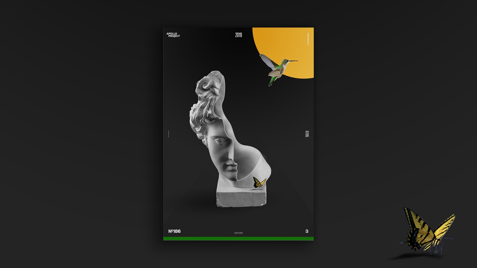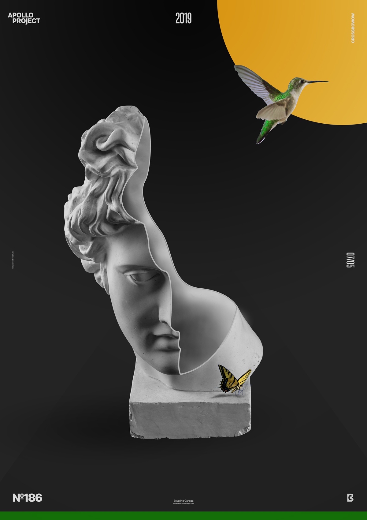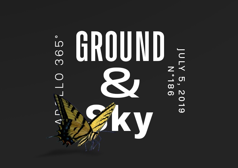
After finishing the mini-series Aurora Graphics Posters, I created Ground and Sky, which is minimalistic and almost poetic.
The Design

I intentionally used too many elements on this poster. I was only about to show half of Apollo’s statue because it is an extraordinary piece of design. And also because I nicely made it, of course! Instead, I add elements that shouldn’t be there. Maybe it is the geometric forms or perhaps the bird. The butterfly is splendid. Maybe Apollo and the butterfly were enough together. But, I felt something was missing, and as time passed, I was in a hurry to finish the design.
Then, I made the wrong decision using the green rectangle on the bottom. The circle is probably fine. Or no, it is too much and doesn’t work well with the other elements.
I am globally satisfied with the design, except that I wanted to do and add more stuff to it. The tricky part of the creation was cutting Apollo’s head and showing what was inside. Fortunately, I previously removed the background of the two images I used. Classifying files is time-saving!
Speed Art Poster #186
You will be interested in how I cut and added material inside Apollo’s head. If you are curious, you must look at the Speed Art Video I made while working on the Ground & Sky poster! Come back here tomorrow for poster #187!

