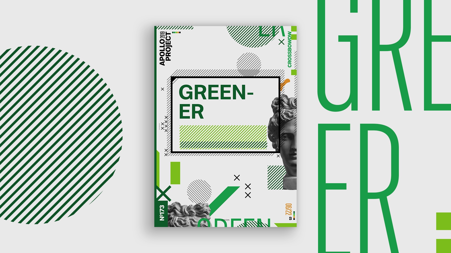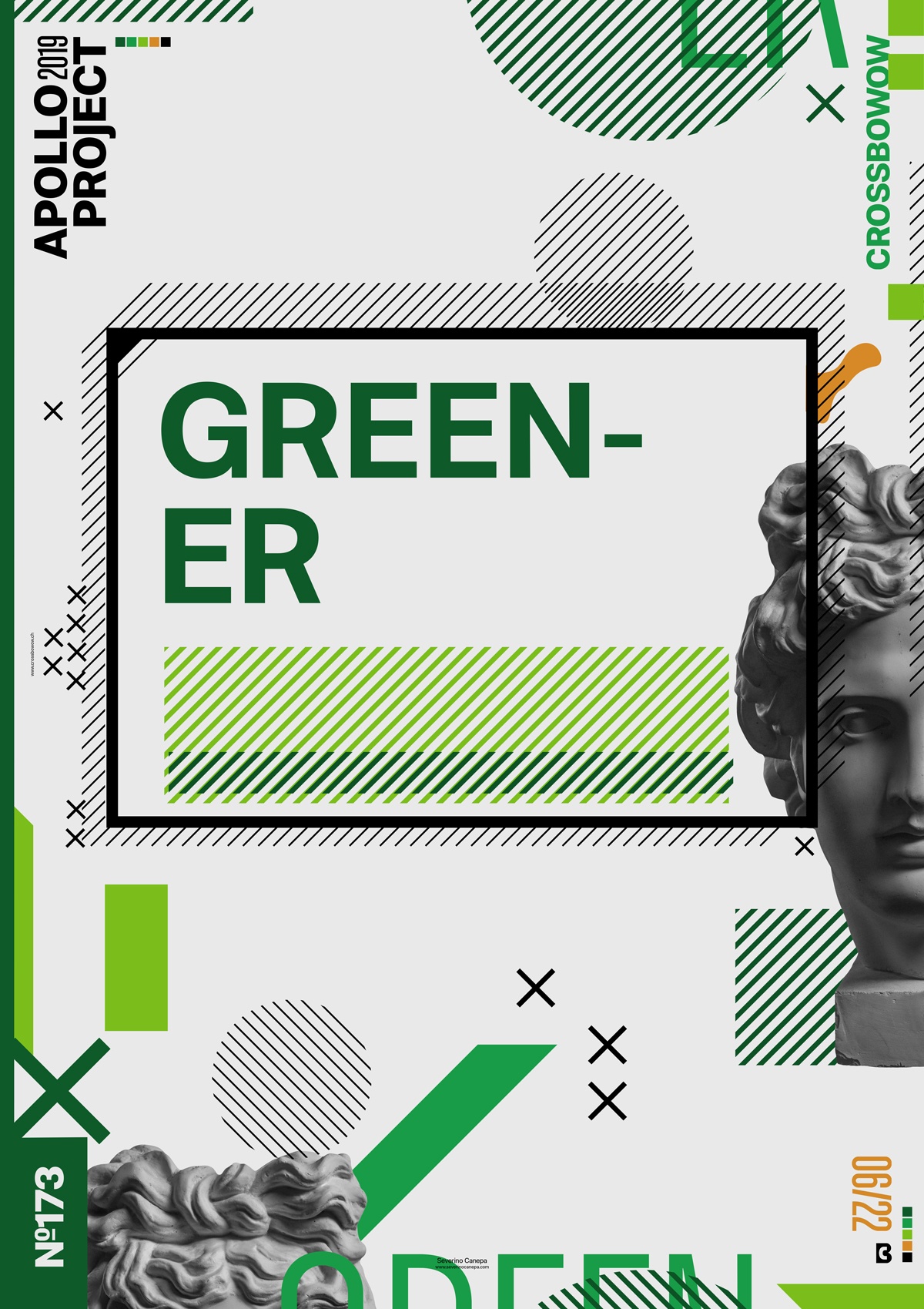
Another geometric poster design made with patterns, typography, and the Picture of Apollo.
The design

Today, I wanted to make some changes to the layout, so I started by modifying the type around the canvas. With all the green I put inside, the poster’s name quickly came to mind while creating it.
I also wanted to play with geometric forms, especially the pattern of lines. I used three shades of green, black, and orange as a contrasting color, just one touch. I like the visuals of this poster, but I am not satisfied with the global composition and disposition of the elements. I think I will start a new mini-series. Nothing is sure for now!
Speed Art Poster #172
It was a lovely rainy day to design a poster! I think you will enjoy watching the Speed Art Video about the conception of the Greener Poster. I changed the look quickly and moved to something better.

