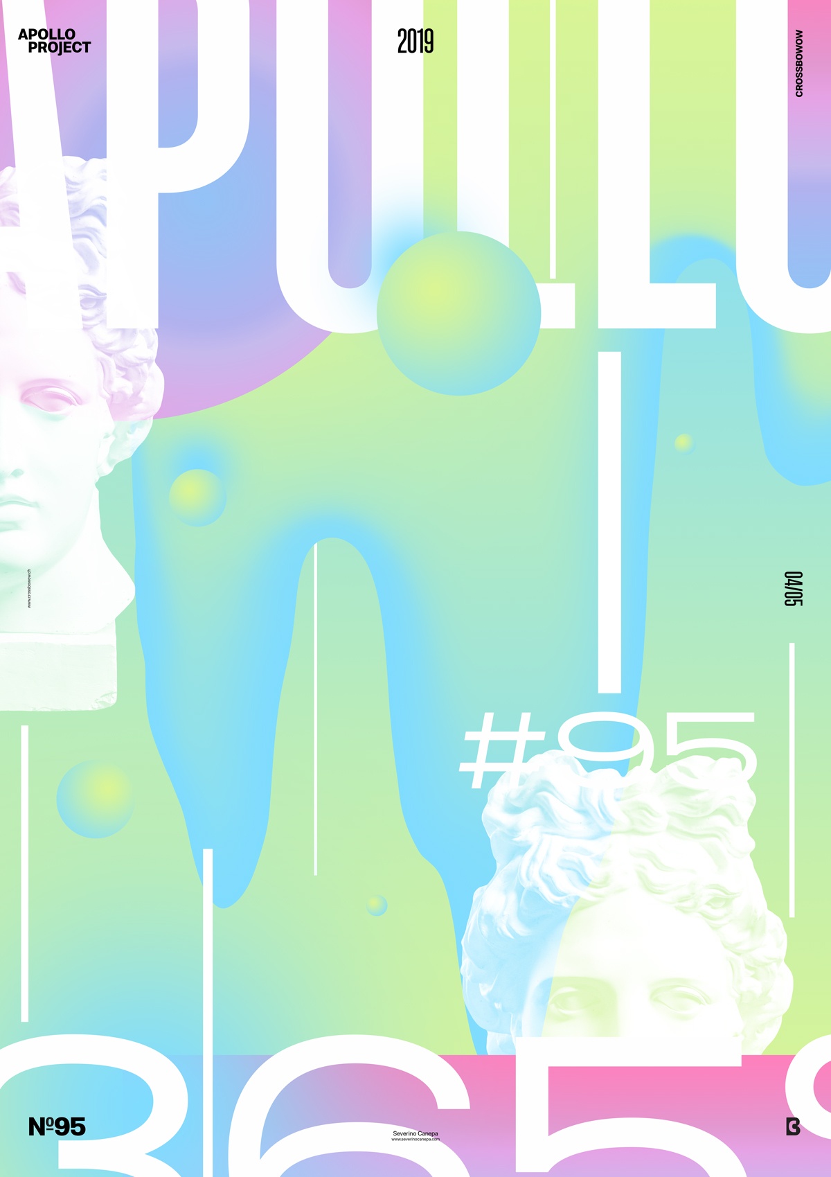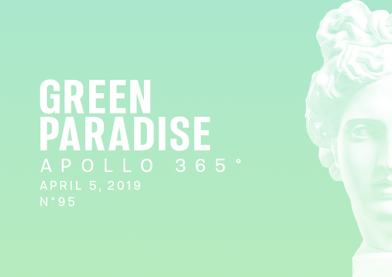
Poster #95 is a design based on gradients, geometric shapes, Apollo’s head, typography, and an opposite color scheme.
The design

I tried different variations until I found a good fit between the elements and the reduced color scheme. The most challenging part of this poster was placing the elements without melting them in the background and being subtle about their appearance.
Finding a good balance and combination between the condensed and extended stylestook me a short time, but it was not a big deal. I was about to deconstruct the letters, but I finally noticed they didn’t need to because the colors don’t allow that.
The composition is pleasing. It could be improved with more time, but as you can imagine, I don’t have the whole day.
Speed Art Poster #95
An excellent and sunny day to design the poster #95 Green Paradise!
I hope you will enjoy watching me working on this poster with my speed art video #95!
Have a nice day, and I can’t wait to share number 96 with you all tomorrow!

