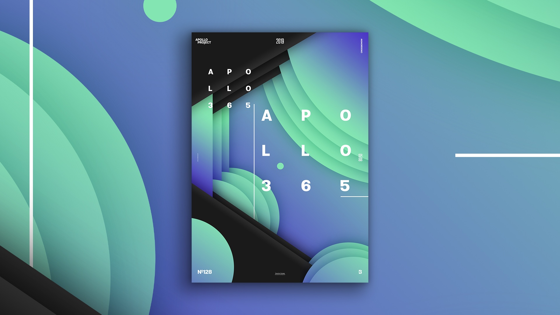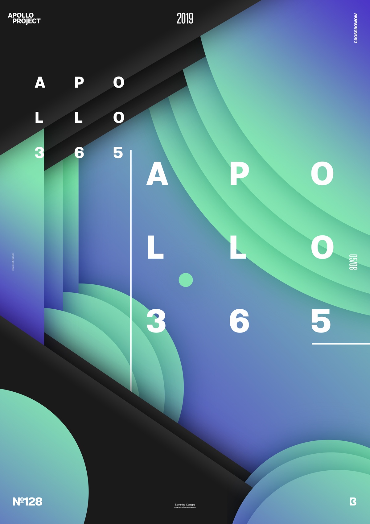
Geometric and abstract Poster #128 was made with dark colors and a gradient. I also neglected to use Apollo’s Statue to change it —only once!
The design

Sometimes, inspiration comes with a cerebral whisper. I found the sketches I made some weeks ago and found an interesting one that caught my fancy, and I decided to realize its designs in Photoshop.
Firstly, I referred to my sketch and copied the global style and proportions. I added the black geometric shapes and then a blue gradient in other shapes.
Secondly, I noticed that it would be more attractive to push the concept by adding more shapes and playing around with layers to insert depth into the poster without forgetting to intertwine them to accentuate the effect of depth.
Speed Art Poster #128
Here we are again for the speed art video of poster #128. Don’t worry; filming my screen while creating posters is not a burden. The only tedious thing is that it slows down my computer’s power.
I hope you enjoy the design of Gradient Stratum and the video! I’ll see you tomorrow to take a look at poster #129!

