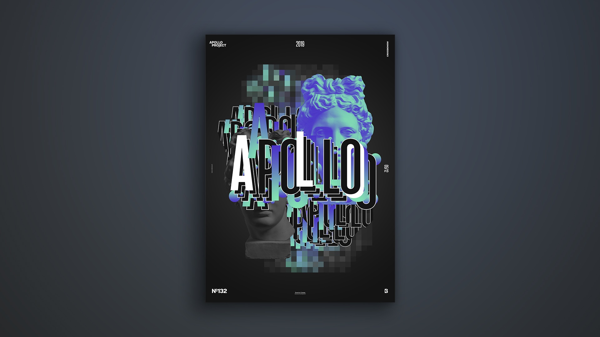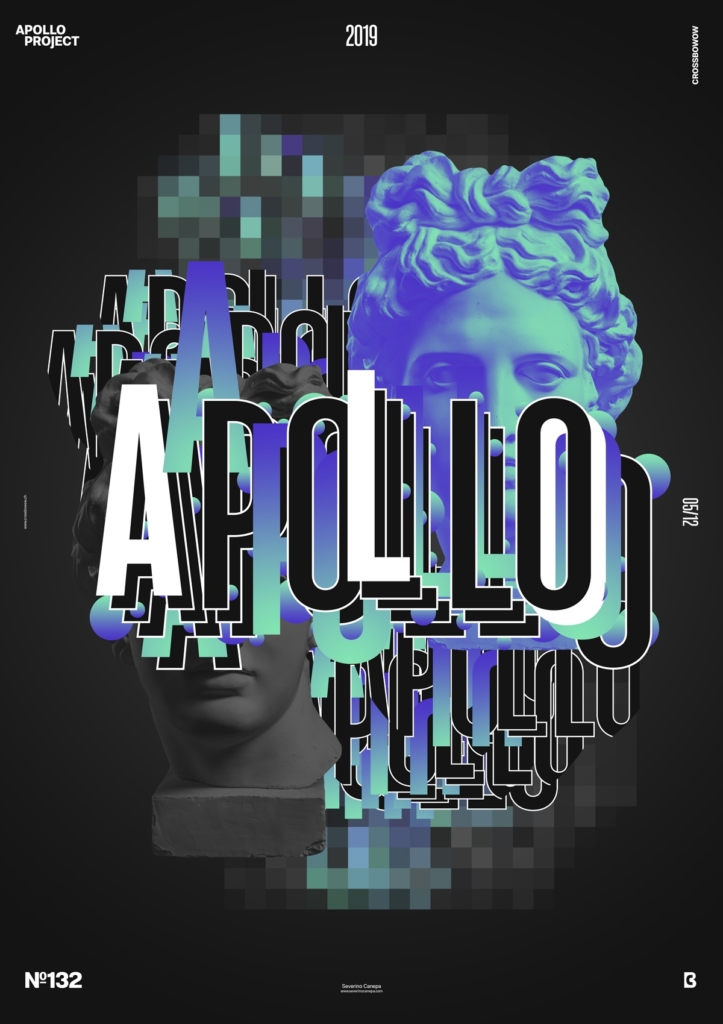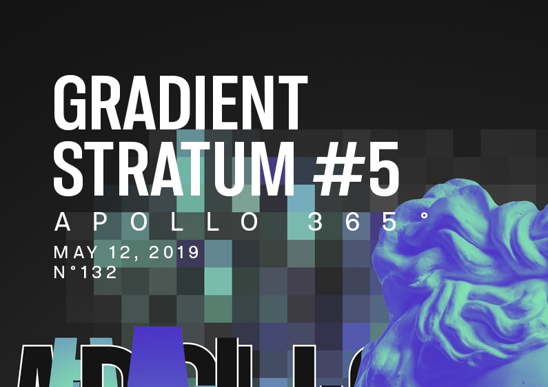
Today’s Poster is a typographic experiment made with the colors of the mini-series Gradient Stratum.
The design
It was a short Sunday to design a poster. Shortly after, I devised a typographic experiment: I duplicated the word Apollo to create a layering system and added ellipses in between. I changed the color of some letters to add dynamism to the composition. I tried to add the diagonal part of Apollo’s picture and white rectangles, but it didn’t match the title well.

After that, I wanted to add some depth by duplicating the forward title and putting it behind. Also, I used two pictures of Apollo’s statue made with two different colors. I used the Filter Pixelate on the two titles I put behind to finalize the poster. There is nothing more to say. This poster deserves more attention, but I didn’t have that time.
Speed Art Poster #132
Today, it was too short a time to design a poster! I came up with something that I am not entirely satisfied with. I will do a better job tomorrow for poster #133 by waking up earlier. That will allow me to spend more time working on it. Whatever, you can enjoy the speed art poster video as usual. I see you tomorrow for poster #133!

