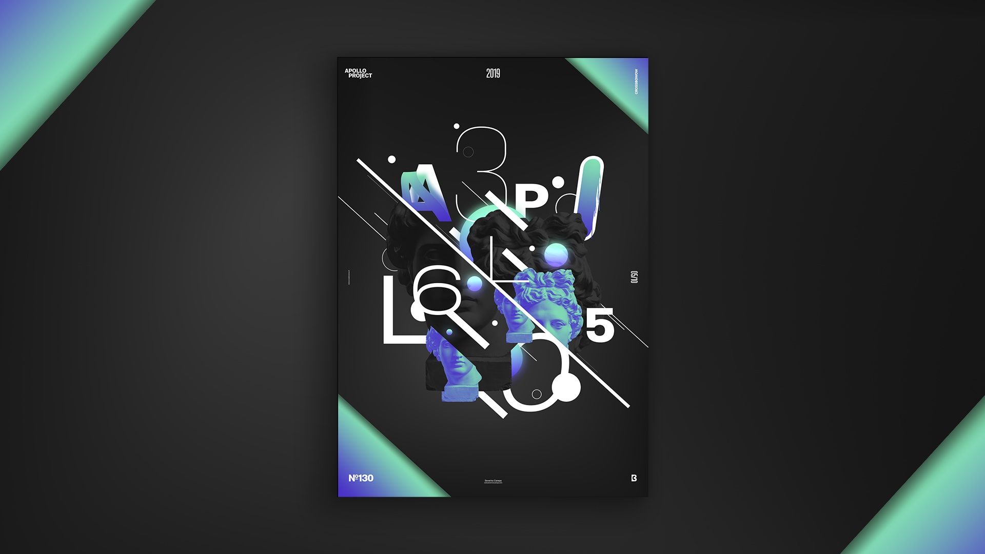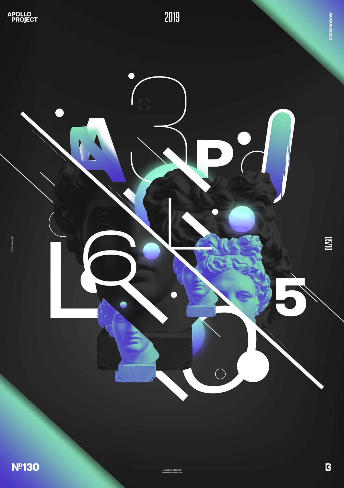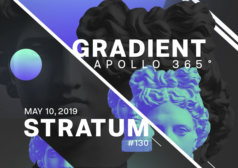
This is the third geometric and abstract Poster #130 from the mini-series Gradient Stratum #3.
The design

As the mini-series wanted, I re-used the poster mini-series geometric, image elements, and colors. That way, I could explore more options and dig deeper into the concept. On the other hand, I still had a time limitation when creating the poster. On the contrary, creating a new idea every day is time-consuming , resulting in less time to spend on creation.
To create this design, I diagonally truncated Apollo’s head and duplicated it several times around a thick diagonal line that cuts half the poster. After that, I added the title “Apollo 365,” positioned each letter , and added different effects to some of them. Then, to add dynamism to the composition, I add other lines with various thicknesses and ellipses.
Speed Art Poster #130
It is no surprise that I made another speed art video about the Gradient Stratum #130. Look to see how I made this poster, and I’ll see you tomorrow for poster #130.

