A word about the Design
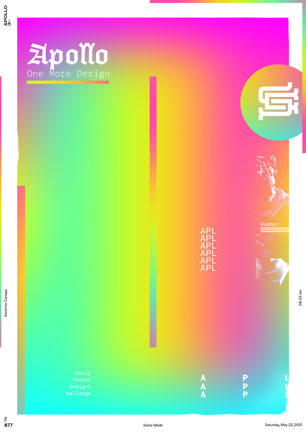
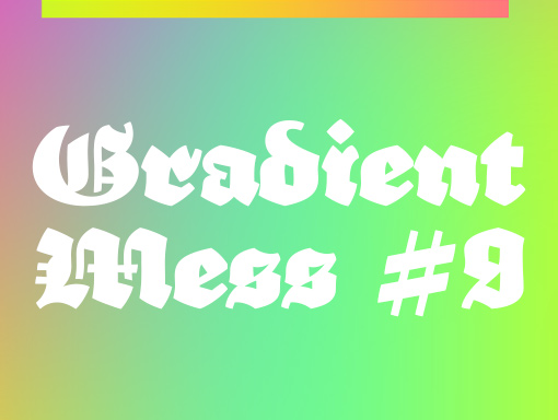
An ancient blackletter and a monospace font together look weird. I admit it. But look at them closely, and it’s okay after your eyes make it usual.
On this poster, I composed a structure with the element to contrast with the one I created yesterday.

