Here we are again!
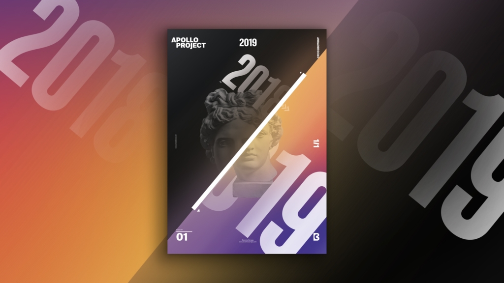
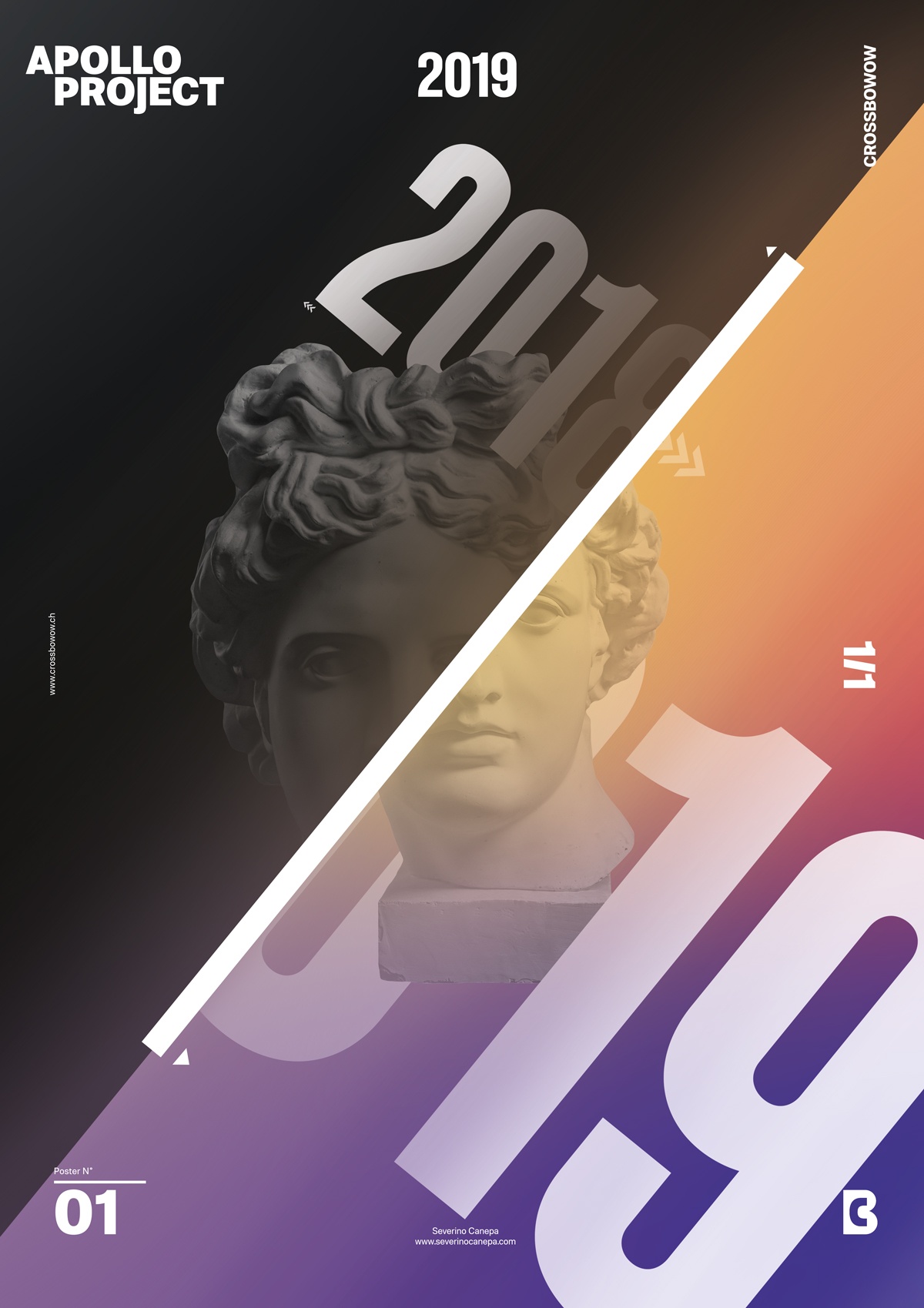
This is the second poster for 2019. It is logically on the 2nd of January, and it is the second poster I realized for the personal Creative Challenge. I have named the poster “Goodbye 2018.”
I gave it this name because I finally realized that 2018 has gone. It is behind us, and I have to look at the future to discover all its opportunities.
A word about the design

To conclude with the design, I represented the turn of the New Year by using a dark gradient and a colorful gradient separated by an oblique line.
The huge fonts 2018 and 2019 are also oblique, giving a dynamic contrast to the rectangle layout.
The small and big year’s letters’ sizes enhance this effect and add depth to the composition. They also seem to disappear behind the oblique separation, which adds another layer of depth and light.
The Minimalist is the first Poster Design I made yesterday. I finished it this morning, January 2nd, 2019, around 1 a.m. It was such a terrible night!
Fortunately, I created the layout composition and Apollo’s picture-clipping mask earlier.
Goodbye 2018 Design Poster Speed Art Making Off
I don’t know if I will continue to create video speed art for the following posters because it’s time-consuming. Also, I am just starting to explore motion design and video editing!
Whatever, I also improved my monogram logo animation a bit.
That’s all for today; this is the Speed Art Making Off the Goodbye 2018 Poster!

