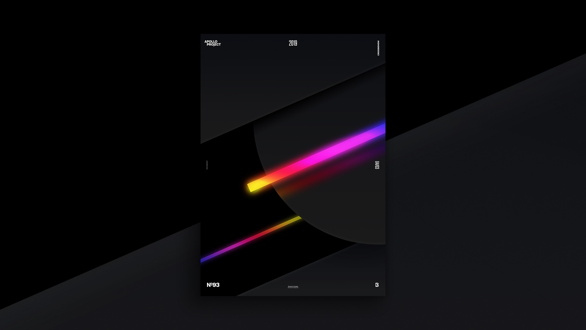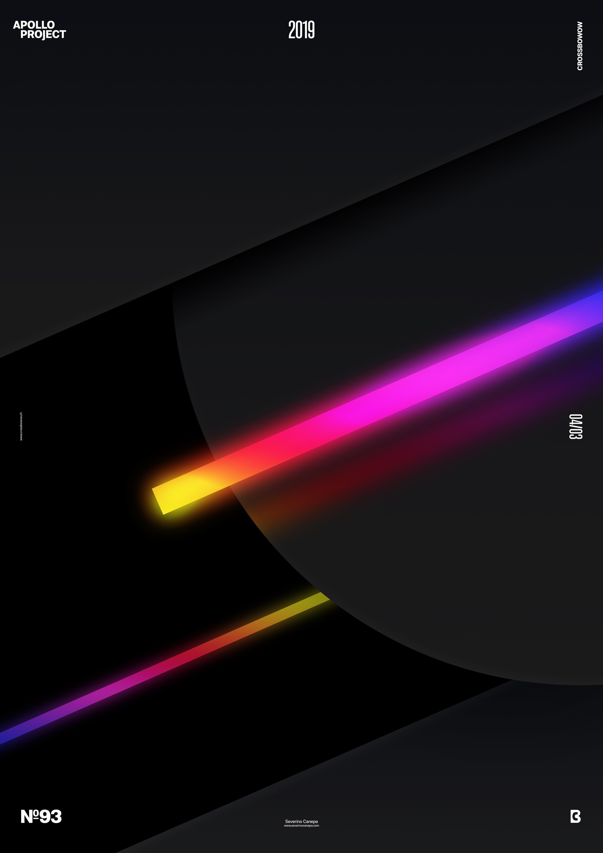
The third poster design for April is minimalist and dark, with minor forms of colors and geometric shapes.
The design

To change my design style, I decided to diversify my work with a minimalist, geometric design. The result is three massive dark geometric forms with two colorful rectangles—so bright they shine.
As you know, minimalist means simple, not easy. Fortunately, this layout comes from one of the sketches I made last week. I found the sheet and saw a rectangle with good vibes inside.
That made me want to explore more by arranging and playing with forms I previously drew. It was a good idea. The result is dynamic and attracts the viewer’s eyes in many diagonal directions. In addition to these benefits, drawing sketches beforehand saves me time and makes me confident.
Speed Art Poster #93
It’s a rainy but nice day!
It was the first time Photoshop crashed while I was working on a poster. It happens sometimes, and I’d like to say that’s life.
For the 93 times, here is the speed art video of how I created the poster. I hope it will inspire you. See you tomorrow for number 94!
Music Credit
Another pretty good song produced by Geographer. Yes, it is the third day I have used his song!

