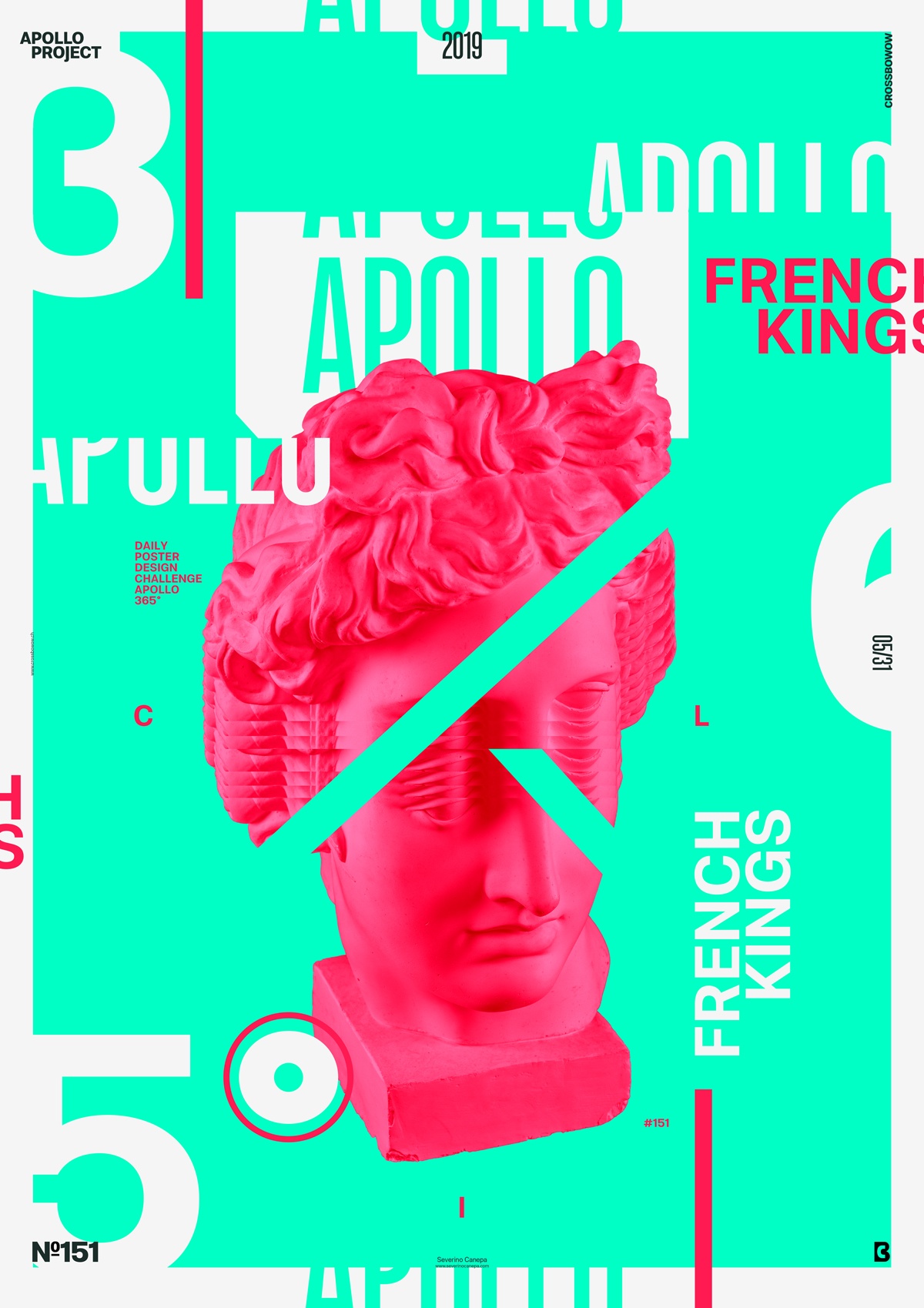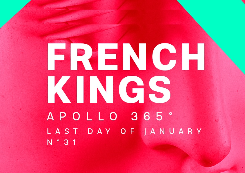
When you allow yourself to freestyle, you can sometimes get good results. I think this Poster Design did that today.
The design

I had no particular idea before starting “French Kings.” The name naturally came to mind while I positioned elements, and the colors whispered the name to my ears.
The colors are bright, intense, and challenging to mix because they blow the eyes. Creating a poster with them together was a challenge. That’s why I used them, even if I initially doubted this choice.
To change things up a bit from usual, I added more text on the canvas to generate a complex layout and increase the viewer’s interest. The poster has a lot of stuff on it, which works well together; the contrast wasn’t a problem. The problematic part was harmoniously placing the vibrant pink without being too much.
Speed Art Poster #151
Hi!
I am making a Speed Art Video about the Apollo 365° Challenge daily. So, if you like today’s poster and want to know how I realized it, watch the video, and you will know!
Thank you for coming to see you tomorrow for the poster #153!

