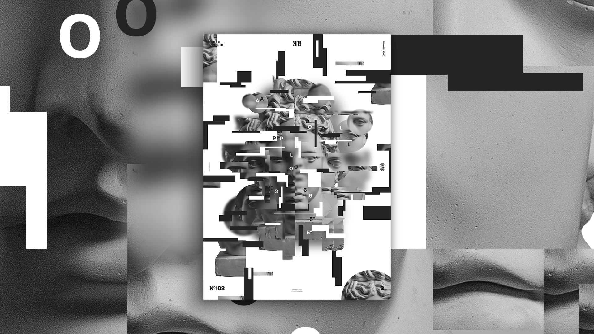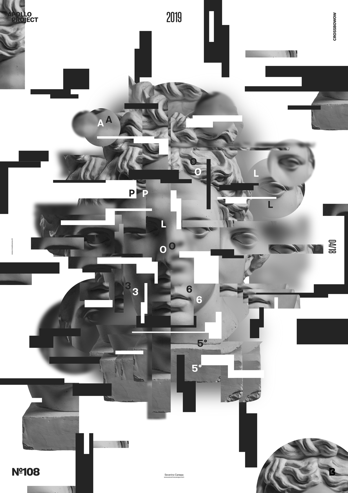
Forfeited Pieces is a black & white and shade of grey poster design #108 made with geometrical forms.
The design
For this poster, I was about to create another Liquify background—that’s something I already did. It was too easy, and I quickly removed it. I noticed now that it was the only color I was about to use. After that, I cut into Apollo’s statue and copied-paste some parts of its picture around rectangles and circles.

The difficulty of this poster was finding the right balance between elements in the composition. By finding the right balance, I mean finding the exact proportions between each form, both weight and size, to maximize the visual impact of the whole poster. Besides, each element interacts with each other. I also took care of the vertical and horizontal alignment between forms. Getting a powerful composition is critical. I didn’t want to obtain a static effect. That is why I cared for every element and its interactions with others.
Speed Art Poster #108
I hope you enjoy the visual of poster number 108 and, more importantly, get some inspiration from it. If you want to see how I created Forfeited Pieces, look at my speed art video.

