I wake up early, intending to accomplish more work during the day. That works well; I progress faster and have more time to spend with my family. I could also spend more time designing posters, but I am still working on a project for a customer—the same one I was talking about two months ago.
The Design

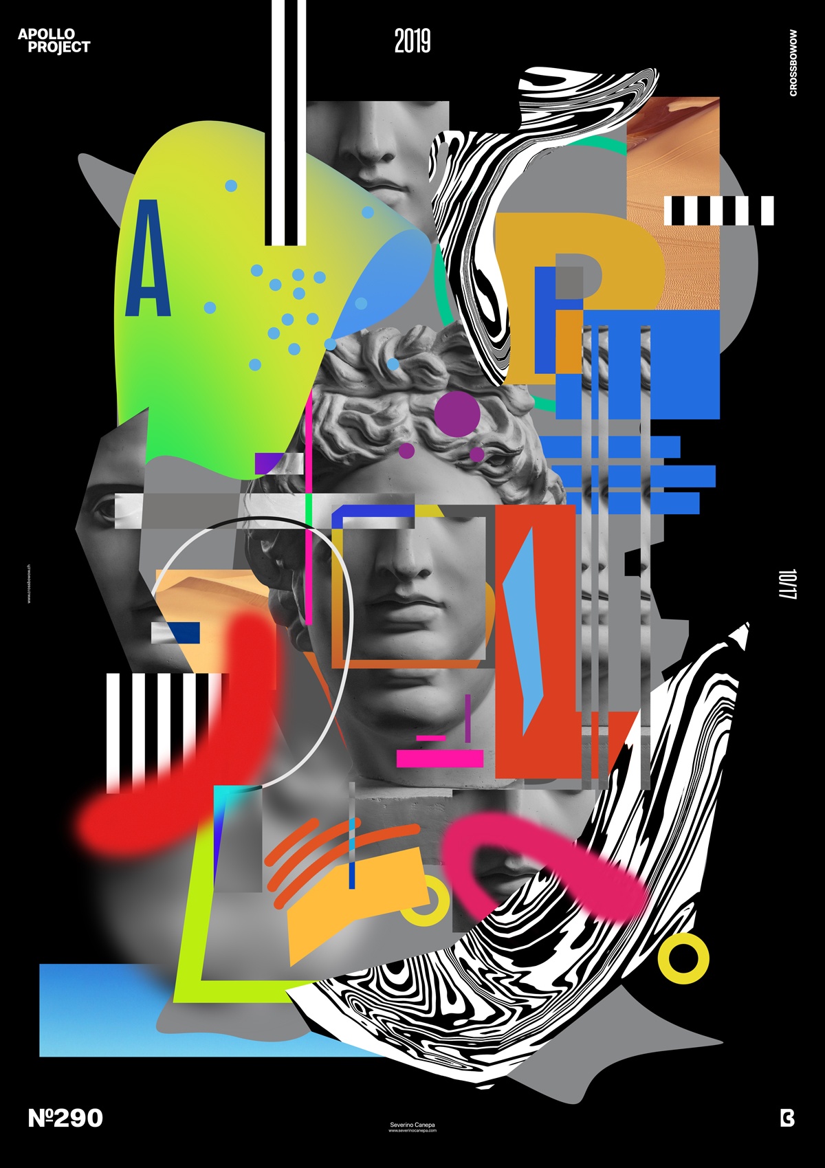
I was only sure that I didn’t want to produce a minimalist design like I did these last days. So, I did the opposite by creating a poster full of colors and elements.
I started the design by creating a sizeable grey shape in the background with straight and curved lines. Yes, it is the shape we cannot see clearly because I added too many elements above.
Then, I added a circle filled with a blue, yellow, and red gradient that I transformed to generate an unconventional shape. I created a pattern with white and black lines and passed them under the Filter Liquify. After that, I added some parts of a picture of a desert, paintbrush lines, typography, parts of the image of Apollo, and geometric shapes such as circles and rectangles.
Looking back on it, I realize there are too many grey colors due to the background and Apollo’s picture. There is also no focal point, which is a mistake I made. The viewer’s eyes go everywhere, and many elements have the same weight. This is another error I can easily avoid.
Except for these mistakes, the poster is successful because of its playfulness qualities.
Speed Art Poster #290
Ten posters to go before the number three hundred! I have kept the challenge until now, and I am not ready to let it fall!
As usual, you can look at the speed art tutorial number 290. If you want to see how I made today’s poster, this is the only way!
I’ll see you tomorrow for poster number 291! Have a lovely evening!

