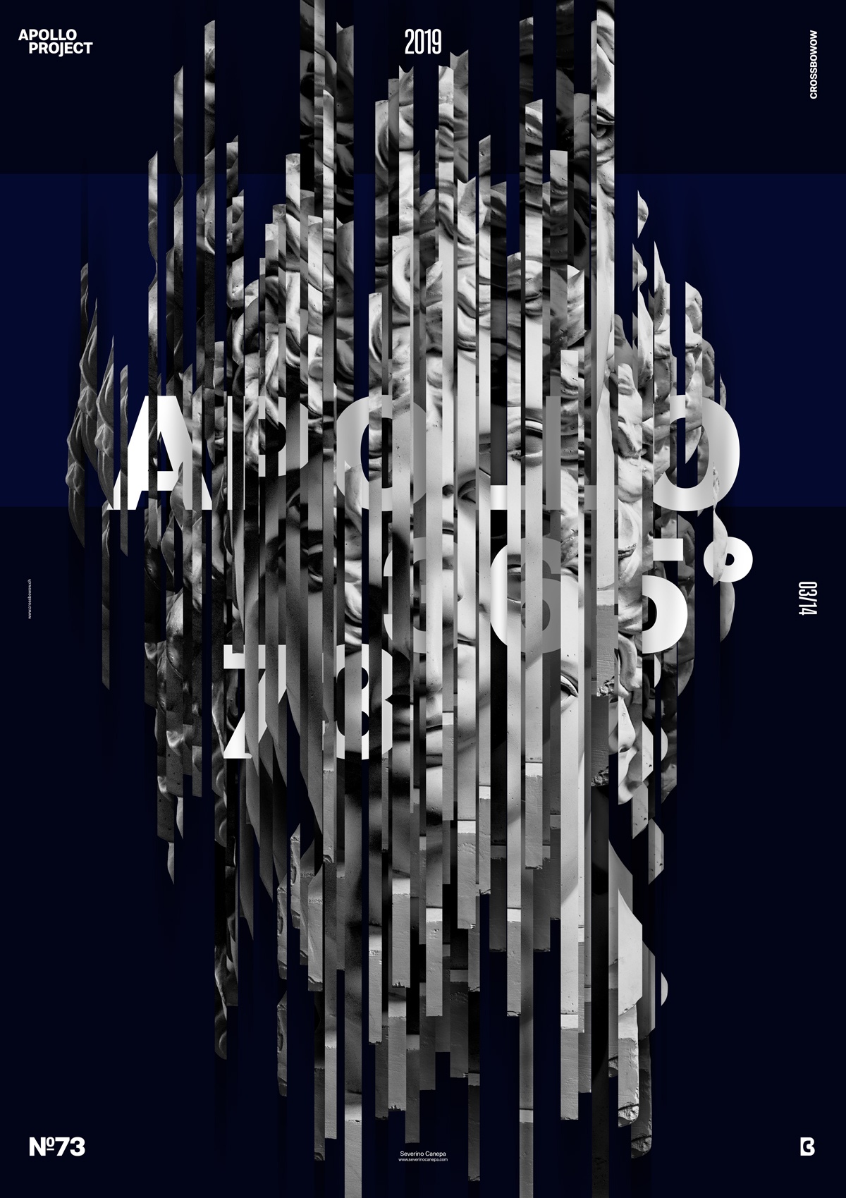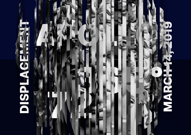
Today’s poster design #73 is a creative Photoshop manipulation that features many vertical slices of Apollo’s head.
The Design
The statue has three layers, two times a directional blur effect intricate inside, and typography between the slices. All of this adds a dimensional effect that brings a sense of movement and speed because the eyes are attracted by parts of Apollo’s head, such as the eyes, mouth, and nose.

Of course, I should spend more time working on the effects to polish elements to get a better global visual. But it takes time, and I don’t have to pay. Two hours to design is the most I can do these days. If not, I will sleep less, which is no longer acceptable for a side project.
The result is good and pleasant, and that is enough sometimes.
Dislocation Speed Art Poster #73
Dislocation is a good poster that took me time to create. If you are curious about how I realized the poster, you can look at the speed art video and the visual.
Thank you for taking the time to read this. Have a nice day, and see you tomorrow for poster design number #74!

